nice job
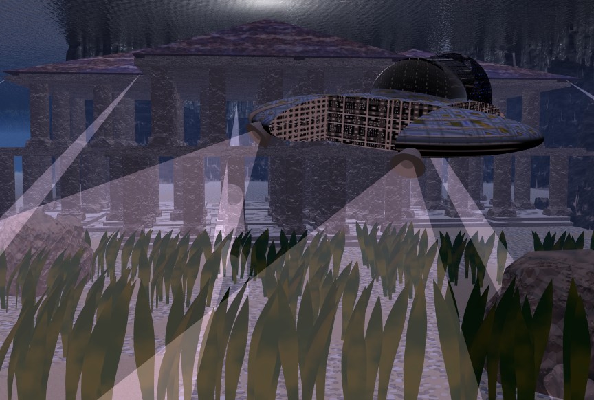
i can tell you're working on this very hard, howver I do have to say that i enjoyed the feel of Atlantis 2. The greenish-bluish ocean color. Great job,
+ i loved the angle on Atlantis 2.
if you want to make this image feel more real, I would suggest angling it at the "grass" level, from there the grass wont seem to big and atlantis will feel bigger, also.
I would also suggest hightening the water level. It would seem more like "discovering atlantis". Know what i mean?
one final suggestion would be to maybe make the ocean floor a little less straight. At this flatteness, the image feels less like an ocean.
I have to admit that I love that ship. I know bryce5 is very difficult to work with in making a ship. But the texture fits very nicely. Another thing I like are the spotlights from the ships. Reminds me of the movie Atlantis.
One last comment: your choices of texutres are thought out (at least they seem that way:) and fit very well with the image.
Great job,
DI
diablotraviesoArchived
Yeah.....
more work on it. I know it is hard to place the lights. Can't get the under water effect right etheir.
Comments 3
A conversation around the artworkSign in to join the conversation.
nice job i can tell you're working on this very hard, howver I do have to say that i enjoyed the feel of Atlantis 2. The greenish-bluish ocean color. Great job, + i loved the angle on Atlantis 2. if you want to make this image feel more real, I would suggest angling it at the "grass" level, from there the grass wont seem to big and atlantis will feel bigger, also. I would also suggest hightening the water level. It would seem more like "discovering atlantis". Know what i mean? one final suggestion would be to maybe make the ocean floor a little less straight. At this flatteness, the image feels less like an ocean. I have to admit that I love that ship. I know bryce5 is very difficult to work with in making a ship. But the texture fits very nicely. Another thing I like are the spotlights from the ships. Reminds me of the movie Atlantis. One last comment: your choices of texutres are thought out (at least they seem that way:) and fit very well with the image. Great job,
Yeah..... more work on it. I know it is hard to place the lights. Can't get the under water effect right etheir.
LOL (Bursts out laughing)