FROM THE COMMUNITY COLLECTION
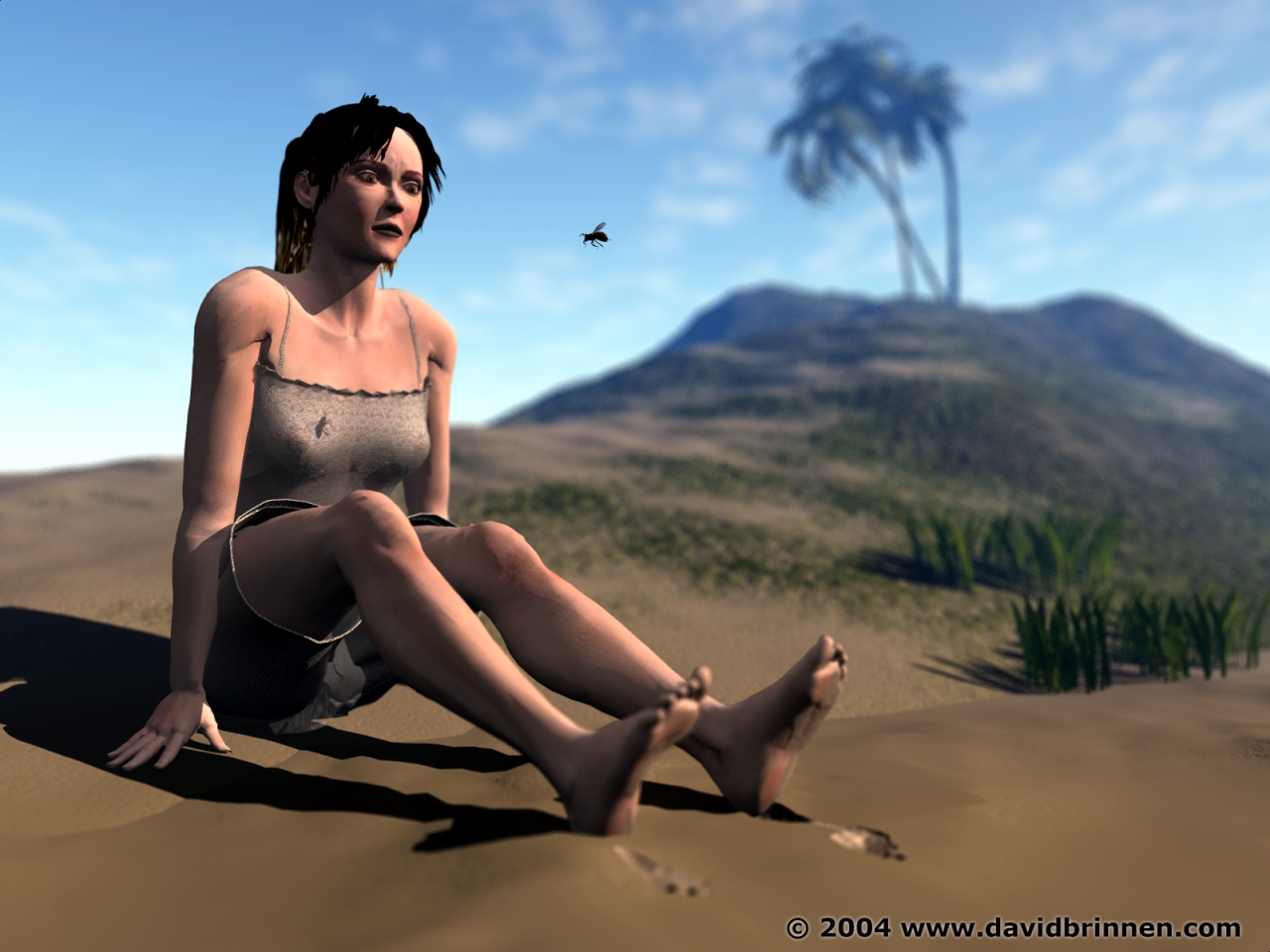
EeekIII with small bee
This is two images combined in one with PSP7 - one of the images using normal daylight (most of the pic) and the second the model in a black void surrounded by Beanz HGL to provide moddeling in the shadow regions (and give Horo a good view of the ear). As you can see the bee has been reduced in size and one or two other tiny tweeks have been made. Hopefully this is the end of the matter, this pic is starting to drive me crackers - or more so... if you will.
Loading unique views5,315 unverified legacy hits5.0 archived rating2004-12-14 added
Comments 5
A conversation around the artworkSign in to join the conversation.
Sorry Ok... I guess it's my fault you made this. What I was trying to say then was that the bee DOES look realistic but it didn't look like it should be there at all. However it does look a bit better now :)
THIS IS FOR DAVID Hey dave I do not no how to post on the bryce5.net site yet so I am going to post this here...Oynx did a blue sun image a while back and I know you are curiuos how he went about it.? well Ill tell ya..First of all hes lying...it was not in bryce beacuse I have the originall saved in my pictures IIts actually a sun thats green and it looks cool but Ive done the exact same thing onyx has done its so easy he took the image in a photo shop and changed the color so that little bryce5 wre frame is so not reall ...if you take a minute..pauz and look at it...you can tell the wire frame has no realtion ship to the image....if you want I can send you the origanal picture via email no prob....I am very sorry to give ya the news man BTW awsome picture here I love the new bee and I dont mind the eyes at all their fantastic! 5/5
Sun tan The killer-bee didn't disturb me too much and I go with LitoNico concerning the look of horror. However, the bee is more natural in this size. I liked the skin colour best in the 2nd version. The ear definitely deserves the extra light -- good work should be visible and shown. Personally, I prefer softer contrast. Hard for me to decide between v.2 or v.3. BTW, the Nov mag is on its way, looking forward to get a hold of it.
Two things... I actually liked the first bee better, as it added a reason to the woman's horror. also, the colour of the eyes disturbes me. it is a kind of blanched yellow mixed with pea soup. yuk. otherwise, this is perfect.5/5.
heeh Nicely done, I think it looks great, everything looks right, and quite realistic, good work!