FROM THE COMMUNITY COLLECTION
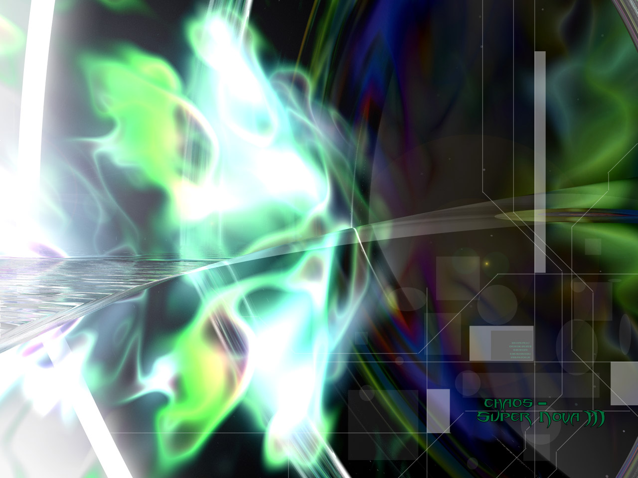
Chaos - Super Nova III
My Super Nova series continues! I went for a more dark and 'chaotic' wallpaper this time. There may be a 4th super nova, but i'm not sure as of yet. Once again credits go to David Brinnen for the plasma fire :o)
Loading unique views5,212 unverified legacy hits5.0 archived rating2004-12-19 added
Comments 2
A conversation around the artworkSign in to join the conversation.
hmm, points taken. It's not very easy to judge abstracts, so I can pretty much understand what you mean. This one out of the 6 is probably the most abstract, and is most deformed, so i've been thinking of actually re-doing it to make it actually look like a spacestation, but i'm not sure because i'm running out of ideas on how these space stations should look like, and since they're supposed to be half organic, it gets harder =/ But atm i'm finishing up the 5th space station, which is called Implosion. This one is alot more colourful, sort of like Trancemission was.
I'm torn with these abstracts, I like them alot but I really don't know if I should - er that doesn't make sense, ok, from an artistic point of view I don't know what value to attach to them - hows that. But I like them. Technically it is a good render whatever it is, good contrast and pleasing range of colours with no sign of any nasty banding. Don't know about the font, I like it better in this one than in the fourth one, but I think maybe it wants to be cleaner and less styalistic so as not to detract from the image.