FROM THE COMMUNITY COLLECTION
Away from the sea
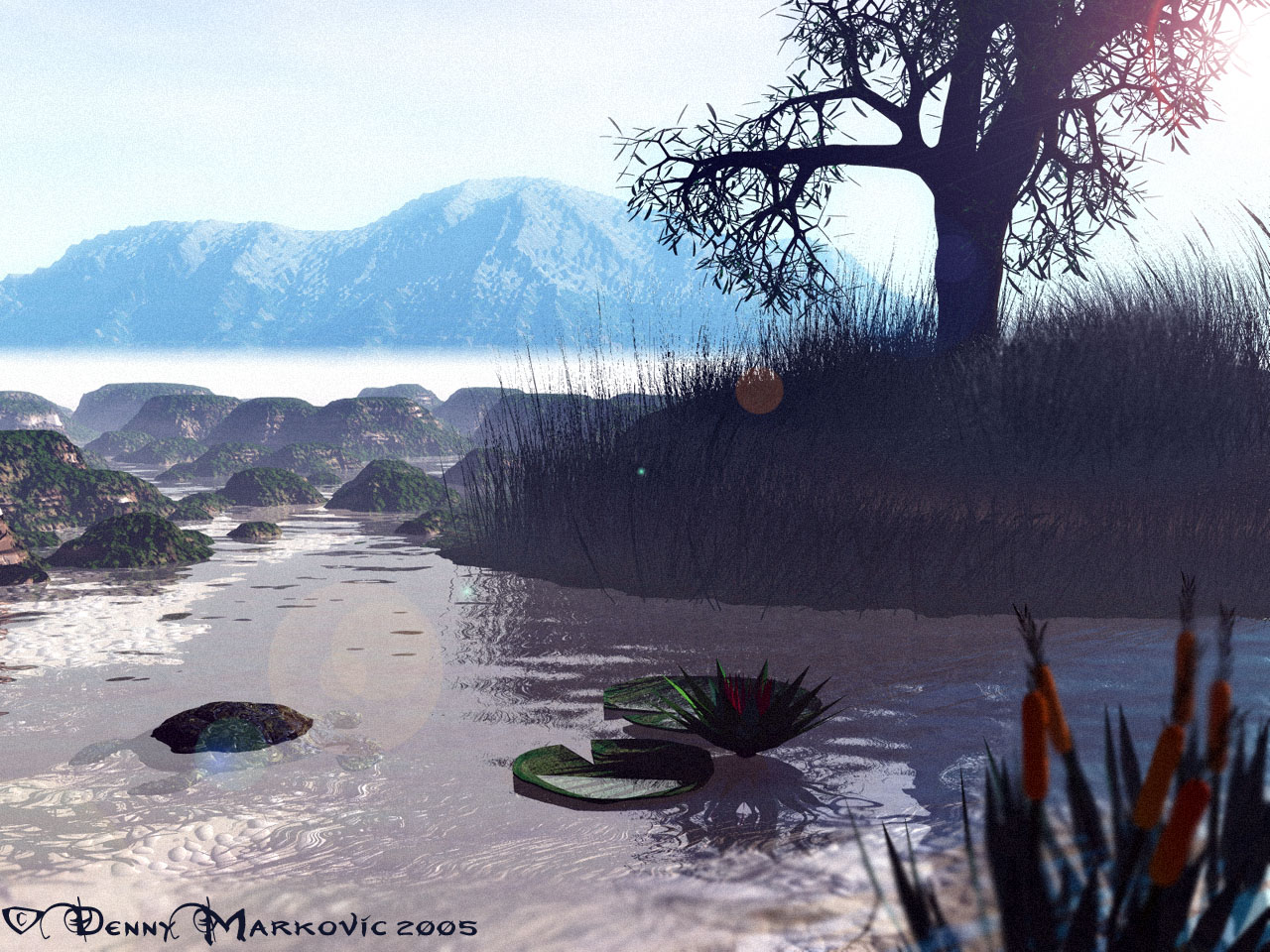
Taking a more different approach to my landscapes in this design, no light rays, and it's more 'atmospheric' or so I think in this image. The placement on the small island with the grass and such took around 2 hours all together, because of some annoying conflicts which I eventually abolished. Not sure what I was to call this image, but overall I like the name now, and its overall outcome.
Loading unique views4,636 unverified legacy hits4.5 archived rating2005-02-16 added
Comments 2
A conversation around the artworkSign in to join the conversation.
Well just to prove I can I'm going to disagree with Horo and say that I like the mountain in the distance. Water has worked out well, maybe could do with a touch of blue. Island tree and sun is fine, not sure about the material on the mounds on the left seems a bit course. Being a bit critical I'm not sure about the grainyness of the distance or the DOF of the bullrushes - but that is more a matter of taste. On the whole I like it, but in a way that I don't agree with Horo too much. Good work.
That grassy island with the tree is really excellent. I wonder whether the grass in the water is intentional. I also like the ?riverscape?, but I'm not so sure about the water. Nice turtle, though. Somehow, the mist and the far mountain do not fit the composition. I cut the pic in an upper and a lower half around the mist and both parts look very nice. But I think they hurt each other.