FROM THE COMMUNITY COLLECTION
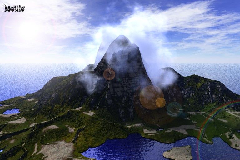
Ka'Ke'teeoh Island Remix
IMO much better, I give all my thanks to Frozen Cry Who helped Me through The making
Loading unique views4,434 unverified legacy hits0.0 archived rating2005-03-14 added
FROM THE COMMUNITY COLLECTION
IMO much better, I give all my thanks to Frozen Cry Who helped Me through The making
Comments 7
A conversation around the artworkSign in to join the conversation.
It's more of a matter of taste when it comes to the water. Personally the blue water is fine as it is, and the lens flare more than makes up for the other sun.
Hahahahhahaha hahahhahhahahhahhahahahhahahhahahhahahahhahahhaaaaaahahahhahahahhahahhahahahhahahhahahhahahahhahahahhahahahhahhahahhahahahahhahahahha....Im not laughing at you the whole grinds teeth and turns purple caught me off gaurd. Uhm I love the mat file i think its much better thankyou very very much. Basicly. Instant messenger is a free program you can download and you can directly char with people instead of Typing a few paragraphs and a couple hours or even days later you will get a response If that sounds appealing you should run a google search on AIM and download it. ( dont worry its 56k Compatible with your internet) THANKS FOR THE FILE. Jesuis
Uh? What's one of those? I'm sorry I'm a bit of a dunce when it comes to computers and the internet - it takes me all my time to work my email. People tend to assume because I can work a renderer or wings that I can work any software, but really I'm very stodgy at that kind of thing, if you want proof of that you should see may poor old bryce manual I've nearly warn it out. I'm scuppered when anything comes with a .pdf manual because I can't get to grips with that acrobat reader.
Will do Dave. Yeah. I was going to say that they water was a bit to blue. Ill change it AGAIN. haha and add you new mat file. thanks dave. BTW you dont have a Instant messanger program do you ?
Better Maybe the water is a bit too blue... If that is the bluebellwoods material (and you haven't altered the scale) then try the variation out that I'm going to upload - can't make any promises since I don't know your lighting - so it's a case of just try it and see what happens.
Well The ripple of the water is better, I liked the colour on the previous one better, though. It looks a bit like blue ink in the foreground. However, another try, another result, another experience. That's how we learn.
Nice Way better! The water is much nicer, the colors are better, Good work.