FROM THE COMMUNITY COLLECTION
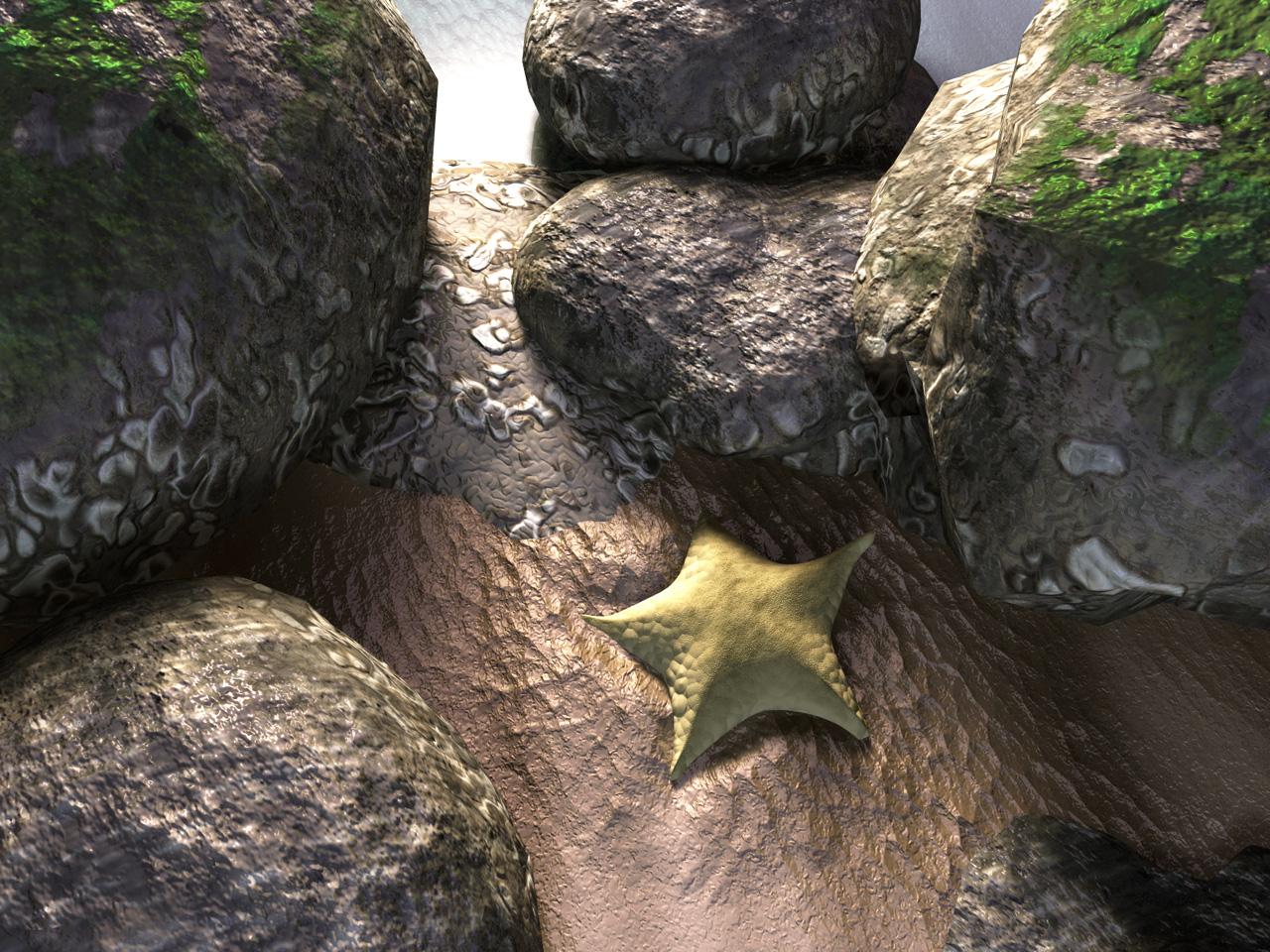
Tidepool Morning
Haven't done a natural scene in quite a while. Starfish is made in Wings. Textures are some mixed presets for rock, David's altered Whitesand for the sand, and my seaweed for the green bits. It would probably be more realistic if I didn't use Bryce rocks, but the render was long enough that I don't want to re-do it. Rendered with soft shadows (for the lights, not on the render settings).
Loading unique views7,495 unverified legacy hits5.0 archived rating2006-08-22 added
Comments 7
A conversation around the artworkSign in to join the conversation.
The lighting is excellent in this, it is very crisp and realistic. Good balance of colours and an interesting subject. Good work. A pleasing study, if let down slightly by the harshness of some of the angled shapes and shadows found on the rocks. Perhaps lattices would privide a more detailed rock shape?
Actually, the seaweed is indeed a separate "layer" of materials, as the seaweed and transparency channel weren't able to fit alongside the rock and barnacles. So, as a variation, what could I do? I have enough criticism here to improve this image, but I don't particularly want to re-upload this one... Changing the lighting to a different time of day is out, it doesn't look near as realistic. Texture changes are out too, because I'm already altering the texture. Any help?
Yeah - I never read them titles. So it's morning, not evening.
The rocks ain't as bad as you guys put it. They're washed over by the tide twice a day so being rounded is natural. The seaweed wouldn't be bad if it just were less bright, green and glossy. The sand looks more like mud to me and it fits in here. The patten on it is outstanding. Light is beautiful, evening I would say. It's not easy to do a close-up job and you did very well.
2 ideas The lighting is the most important choice you will ever make in a scene. I'm glad to hear that you used an actual radial light source for the ambient illumination and not "just" the ambient channel button in the materials lab. There may still be some ambient channel at work here but if so it is minimal and appropriate. Nothing appears to glow flatly of it's own accord as with overuse of an ambient expression would cause. The "realness" of the image comes from that lack of ambient and the use of a more genuine light arrangement. All of your illumination is directional, and that adds to the realism. Second, ideas for the vegetation on the rocks. If I were you, I would try to do one thing at a time and work in layers. One layer for your stone, and another blend transparency layer with your vegetation mapped out on a slightly larger duplicate stone one inside the other. We often kill ourselves trying to make everything happen with one material. Usually when putting vegetation with stone as one material one of the two looks slightly compromised and less than ideal. With layering, you can then go as crazy as you want adding as many vegetaion layers as you desire. You can even make some of the layers a touch larger than usual so that they can cast relief shadows as real vegetation would. If I'm not clear in what I'm saying i can explain it further. We all work with layers in 2d programs with great results. Working in layers in 3d doesn't often occur to us, but it should because it's very effective. Richter used the same idea in his hdr simulation render.
The lighting is nothing special; one white-yellowish radial light as the sun, one bluish radial for the ambience. I'm going to argue that specularity issue (though I do seem to have a history of abusing it), because it matches the rest of the materials- the tidewater having just receded. I think I didn't put any specularity on the highest rocks, despite the seaweed. The water itself doesn't have any bump, it's just very transparent and the bump of the sand is coming through. The green stuff I agree with you on, but improving is difficult. Any suggestions? The textures I'm not so sure about. I like the quality of Bryce realism- looks like it could be real, except it's obviously Bryce. However, I'll remove some of that irritating RND stuff from DTE and put in a nice Fractal or Gradient.
wow! There's a definet feel of realism in this piece. The lighting is very convincing and is doing alot for the image. You are right about the bryce rocks not helping the reality level of the scene. i like the green parts but they don't really look like plant life. They look to me like green colored rock. The water is somehow outstanding. It seems a little too busy in the bump, but the bump is very appropriately chosen generally. The textures of the stones are very close but still not quite convincing. I know, the rocks are shiny again in places that are high altitude and would usually be assumed to be dry. Specularity expression should control how "wet" the rocks appear. If you could suppress it in higher altitude areas of the stones it might help. Still, overall, this piece is a lighting masterpiece and worth the time you spent rendering it. Another example of craft in lighting from LitoNico.