eerie buildings
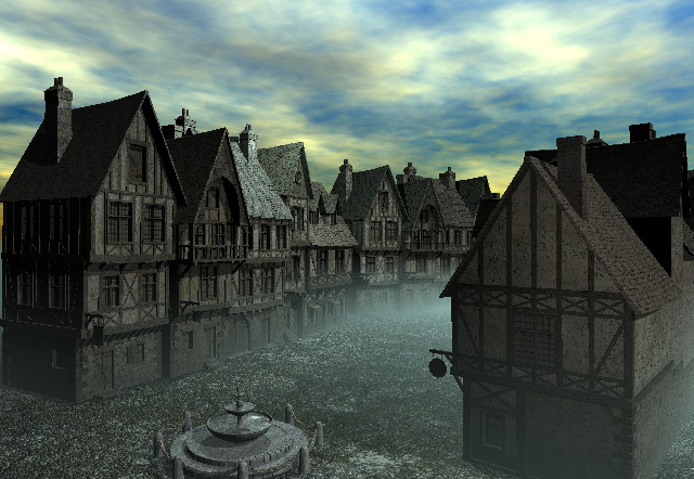
It's interesting the effect this architecture has on people. I myself find the buildings to be both spooky and comforting dependeing on what kind of old fashioned movie i have playing in my head at the time. The grayness of them makes them lok old, abandoned, and spooky. Matute should play arouund perhaps with the textures of the building materials to warm them up with a tiny bit of saturation in a 2d program and them reapply the textures in bryce.
It's also spooky because it's so dark, I really do think a second sun will give it the lightness you need, and will specify the lighter mood I think you wanted this one to have.
NI
Nightst4rArchived
Good!
This even looks errie enough that it could be entered into the Halloween contest...
RA
rashadcarter1Archived
improved colors
It looks like you have taken my advice about the atmospheric settings and the results speak for themselves. The sky color is much more realistic and dynamic. The haze factor also looks like it is a warmer color, possibly pink as I suggested. Anyhow the result for me is a much warmer overall render that just feels more real.
The ground plane material is not reading clearly to me. In fact the entire piece seems to lack of natural smoothness. If you have AA disabled, you should enable it. If you have it enabled but are sharpening the image in post production, dont, or at least not as much. We want our work to be seen and details appreciated, but not to the point where it should draw attention to itself.
This town seems ready to mature and I get the feeling that you can do many wonderful things with this particular set up.
At some point I would also suggest kicking up the sunlight by disabling the default and installing your own second sun and position it to match the sun settings in the sky lab. Bryce does not do the sun justice, as the real sun is much brighter than the default bryce sun. Also, consider using secondary light sources as have been discussed lately to fill in your GI. Nice work once again.
Comments 3
A conversation around the artworkSign in to join the conversation.
eerie buildings It's interesting the effect this architecture has on people. I myself find the buildings to be both spooky and comforting dependeing on what kind of old fashioned movie i have playing in my head at the time. The grayness of them makes them lok old, abandoned, and spooky. Matute should play arouund perhaps with the textures of the building materials to warm them up with a tiny bit of saturation in a 2d program and them reapply the textures in bryce. It's also spooky because it's so dark, I really do think a second sun will give it the lightness you need, and will specify the lighter mood I think you wanted this one to have.
Good! This even looks errie enough that it could be entered into the Halloween contest...
improved colors It looks like you have taken my advice about the atmospheric settings and the results speak for themselves. The sky color is much more realistic and dynamic. The haze factor also looks like it is a warmer color, possibly pink as I suggested. Anyhow the result for me is a much warmer overall render that just feels more real. The ground plane material is not reading clearly to me. In fact the entire piece seems to lack of natural smoothness. If you have AA disabled, you should enable it. If you have it enabled but are sharpening the image in post production, dont, or at least not as much. We want our work to be seen and details appreciated, but not to the point where it should draw attention to itself. This town seems ready to mature and I get the feeling that you can do many wonderful things with this particular set up. At some point I would also suggest kicking up the sunlight by disabling the default and installing your own second sun and position it to match the sun settings in the sky lab. Bryce does not do the sun justice, as the real sun is much brighter than the default bryce sun. Also, consider using secondary light sources as have been discussed lately to fill in your GI. Nice work once again.