FROM THE COMMUNITY COLLECTION
Vale of the Wraith
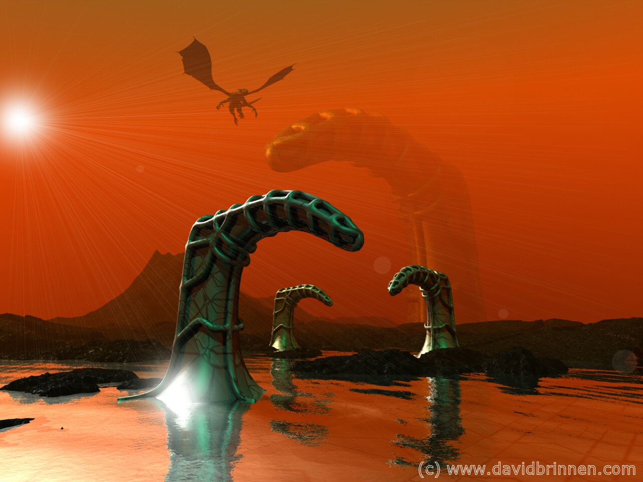
A fantasy image made for the birthday of Zethara. Who's birthday was on the 17th of September... I guess I'm running a bit behind. DAZ milenium dragon. The curious talon shapes were made in wings3D and the post production in PSP7. Highly speculative materials with unusually high values imputted for speculative halo colour have been used to simulate ambient light and multiple dim lightsources used to set off the effect.
Loading unique views3,873 unverified legacy hits5.0 archived rating2006-11-04 added
Comments 5
A conversation around the artworkSign in to join the conversation.
Well spotted LitoNico, that is indeed where you saw the dragon, I was going for a sense of continuity. I'm pleased you like the effect of the towering finger, I particularly wanted that to set a tone of awsome strangeness to the scene. The atmosphere itself, somewhat tomarto soup, was intended to contrast with the green of the structures - risking a bad clash with the red - green combination, but somehow I seem to have got away with that one!
I think I've seen that dragon before... perhaps on your other Zethara-birthday image over at dA? To me the atmosphere looks a bit flat, though not a bad thing, perhaps. The obscuring of that towering finger is a very nice effect. Light rays are a bit odd, but they fit the scene well. I'm as torn as Horo about the dragon, but the interesting shapes and pleasing composition get my 5.
atmosphere To me this image is all about that atmosphere. Really cool effect as I am drawn into the pic by the way it hides the more distant objects. The rays from psp7 are familiar to me, as I also use that program. I see why you used them as Bryce unfortunatrely still provides no sun rays or God rays. They are not my favorite choice, but as I said I'm familiar. Perhaps if the sun had a touch of a color hue, perhaps closer to the atmosphere color, it might bridge the two. It might make it look as though the atmosphere is being painted this color by the sun, which makes sense naturally. I love that bright shiny area under the foreground structure. These little touches really elevate your work and add the level of risk and immediacy that I truly admire. Dragon, doesn't bother me, althoug adding one or two more will make it look like dragons belong here for some reason. Maybe they are looking for someone?
Since I put the dragon in first it's difficult to imagine the image without it... but well, it's worth a thought... I do like Gigers work, technically... but a lot of it is rather grim and pervy. Good thing or a bad thing? Difficult to say really.
Apart from the colour, it has something Giger-esque in it. Must be the mechanical looking snakelike shapes. There's a lot of harmony in this setup. Excellent composition. I'd give it a five but I'm teared apart about the dragon. Does it enhance or spoil the impression? I just can't make up my mind.