FROM THE COMMUNITY COLLECTION
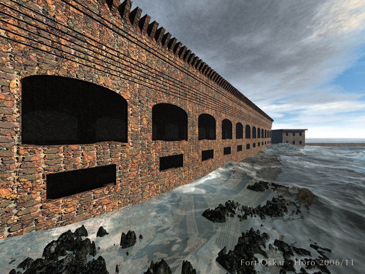
Fort Oskar
Inspired by Fort Jefferson at Florida's Garden Key in Dry Tortugas National Park (featured in the NGS Magazine Oct. 2006, p.82). The fort's face is a terrain, quite elaborate to create, as I had to find out. Water and rocks are also terrains. The rest was made with cubes. I used the default Bryce 6.0 sky (another one of David's, in fact), I did a few changes to it, though, most notably the option to cast shadows was engaged and the sky dome set to black. This killed all the light but gave the water a nice colour (David's Combers), so I had to add a second sun. No ambient whatsoever. What makes me unhappy is how the water meets the wall. I ought to have put some rocks in between.
Loading unique views4,074 unverified legacy hits0.0 archived rating2006-11-11 added
Comments 8
A conversation around the artworkSign in to join the conversation.
procedural Wow! That is one kick-@#$# procedural!!! I understand now why you like it and from far away it is fine. Up close is the only problem.
Brick The brick is a procedural material courtesy Jonathan Allen Cummings - known under many other names ;) I like it because it is completely procedural. But being a procedural, it is also somewhat regular. You wouldn't pile up bricks that way if you wanted a wall that holds. But then, it has a rustical feel to it. Your suggestion has still been heard, Rashad. I might give it a whorl sometime.
resolution The brick texture is definetly the right direction, it's just too low resolution to look good at this close view. A higher res version of this or some other random brick would do perfectly. I like brick, so pleae don't change it to something else completely.
so humble, so sweet Horo, I have nothing to teach you. I am indeed your humble student, not the other way around. You have been my teacher for so many years, but you did not know it. I've been visiting this site for many years without joining the forum mostly because of artistry like yours. Your excellence keeps me coming back to learn more. I may have an interesting idea, but you know a hell of alot more than I do about pretty much everything as far as I can tell. You can see whether an idea is good or not. Secondary lighting is nothing new for as I said before it is taught in all professional CG courses, something most brycers don't ever take unfortunately. Playing with Maya taught me these concepts. Thanks for your willingness to entertain my ideas.
Thanks for your comments, they are appreciated. The fort is abandoned, there's nothing going on inside. In fact, I went to some length to make the inside dark but not black. I tried to follow the original. Nevertheless, your remarks are valid. If I wanted the front less bright and dominant, I could have reduced the intensity of the second sun. I have used this wall material on other pictures and always got not exactly enthusiastic comments about it. So you must be right here, too, and I'm wrong, even though I like it that way. Rashad, I'm looking forward for your scene, many thanks in advance. I'm very eager to see what effect the secondaries have. I've still got a bunch to learn.
oops On my monitor at home I can see the fort's colors better and they are not overdone. the diffussion is fine. My work monitor is too bright sometimes. Sorry
lights The sky is great. The water is also. The entire set-up is very plausible. I really can feel the uneasiness of the water. Trully excellent water terrain. The water itself may want more transparency as at this range ai feel I should be able to see through the water. The diffussion may be too high. The water will look more "wet" with lower diffussion and higher specularity. The material on the structure wants a slightly lower diffusion expression also. I can tell the diffusion is set to 100 but 80 would look much more natural as now it looks maxed out, slightly over-exposed. I do alot with bricks and stone photo patterns so I know how difficult it can be to use them and get the right effect. When lighting is adequate as it is here, then 80 does fine. The fort is too dark inside. No ambience is the correct and crucial first step. but the story isn't over.The secondaries are needed to finish the GI simulation. Secondaries. Okay, there is no hard rule for them, but I suggest it as such. You can kill your render time by adding too many secondaries, but some are needed here as in true GI there would be some light bouncing inside the fort. All secondaires should be based first upon correcting the shadows of your primary light source. The secondaires should come from the side more than from above and below. You only need 2 to 3 secondaries in any scene. That's all. Secondaries do not cast shadows. You need them at low intensities to give a consistent shadows range for the entire scene. Think atmospheric bouncing of light. The further away you place your secondaries, (just like your primary)the more consistent their illumination direction is and the more accurate as spread across a large area. I will e-mail you a scene i have set up with secondaries linked to the primary so that all shadows are automaically corrected with each new position I assign my primary.
Sea shape looks good and the material works well (thanks for the mention). The building is a bit too dominating for my tastes and not nearly interesting enough. The brick texture is a little too bold and the lighting does not give much away as to what is going on inside those dark alcoves. I think that maybe with the camera pulled around to the right, a few more light sources and maybe a different mat on the building, I'd like this image better. Don't be discouraged by my comments, the water terrain is working very well and if you could just figure a way to give it some kind of edge wave where it meets the structure it would be most impressive.