FROM THE COMMUNITY COLLECTION
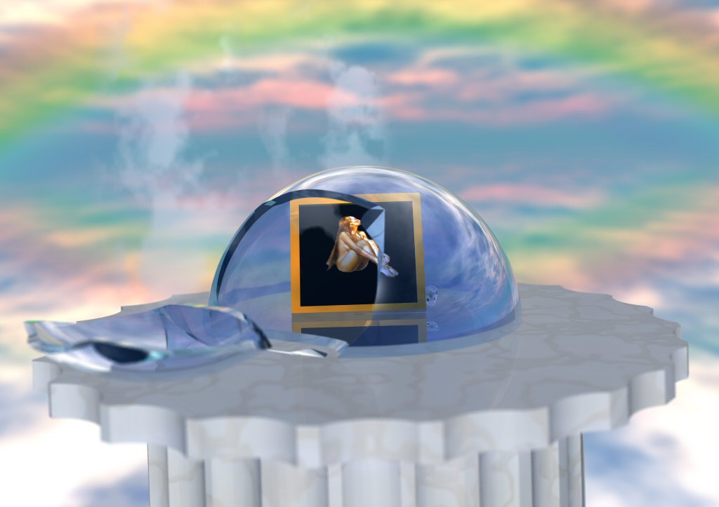
On a Pedestal
Hmm.. well the pedestal fits better, and the slight tilt to the left helped, but now the picture is REALY empty. Pity I dont have a model for tumbleweeds.
Loading unique views3,872 unverified legacy hits0.0 archived rating2006-11-25 added
Comments 4
A conversation around the artworkSign in to join the conversation.
dof The thing about the blurring that throws me is that there seem to be 2 focus points. For some reason I feel that the column of the pedestal is very crisp in focus, yet the image of the woman is also well in focus. True, they line up with one another vertically, so in the way of "depth" they are similar. But the discrepancy in focus between the column and the flat top of the pedestal is more extreme than I would expect. It could well be that my expectations are wrong.
ahmm.... Actually - the bluring WAS DOF!!, (don't know what I did wrong :S it was the same settings as the lrevious render..., but I agree - in this version it just DIDN'T work :( Well, I'll try it once more... (sorry david, going to a realy obtrusive material for the pedastal)
I'm not sure about the tilting... but it's not a critical issue. Like you say the image is rather empty without the tree but then again, I don't think the tree was really adding anything to the image other than "weight". The pedistal is improved with the less obtrusive material, well, so I believe, but again, that is perhaps a matter of taste. It could do with something on the right, or the composition reframing... due to the somewhat abstract nature of the environment it is difficult to suggest what should occupy this space, if it were on a desk, for example, then it would be possible to include say... a pen, a stapler... for example... but given it's present situation, hard to say... Interesting image, but difficult to suggest where it could go from here.
hmm- I see what you mean about the scene seeming empty without the tree. But the photo of the woman is more important now and the image is clearer over-all. The pedestal was better before in that I liked the"'marblesque" texture of the first. Okay, I did not comment on it the first time but the blurring is not really helping. The Depth of Field funtion would blur the image very differently than you did here. I know for certain you blurred it in a 2d app in post production. Nothing wrong with that, but in this case it fails to convince me of the realism. The thing I always liked was the sky and the broken container she's in. There's a sadness behind all these colors. You may not yet be using B6, but his image looks like an IBL candidate. With a proper IBL I feel this image will gain the weight you want it to have. Generally, this is a very nice piece and only you would think of it so it's super cool for that reason too.