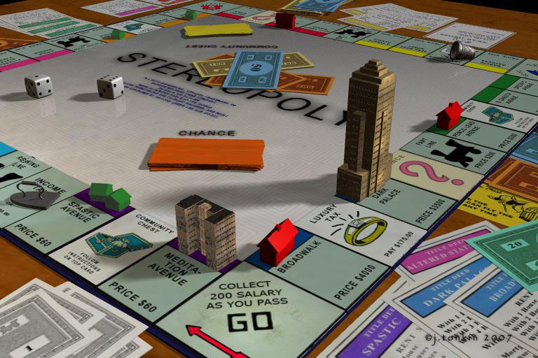
Very nice figures and cards. The textures used are very good as the idea for the whole setup. Rashad made an interesting point about the "wrinkles". You did the Start-field a bit dirty, "used" by many players over and over, so I'm looking at the cards to see if there's the same "used" appearance. If it's a qualm, this is it, truly a minor one. Maybe the guys bought brand new cards to play with. Your lighting is amazing, as the soft shadows "explain" the proper scale of each object in scene and the whole environment. Never below 5/5!
DA
davidbrinnenArchived
Good attention to deatails there, I like everything, however, if I were looking to be critcal I'd say that the paper money and the cards were a little too pristine. That however is a minor point, and really can only be validated by the fact that the rest of the details are so good. Particularly like the grubbyness evident on the start square. And the choice of angles and colours. In truth the only thing I would seriously consider changing is the rotation of the iron piece which is pointing out of the scene, an arrow which is emphasised by the gameboard arrow next to go. Oh and I too like the the surface material of the board, it is very good. It is all very good. 5/5
HO
HoroArchived
Excellent work. Looks very real, nicely lit and great detail. Pitty the jpg-compression made the edges stairlike. Ah yes, I like the plastic finish of the board, the start field is dirty nevertheless - got to sweep it with a moist cloth when the game is over.
RA
rashadcarter1Archived
Realism
I love this work Tonkin. This scene is very impressive. The soft shadows are great. Your avenue names are quite clever. Very expensive proerties in Dark Place and Broadwalk. Your detail in money and cards and dice and player pieces, even your wood table top looks perfectly plausible.
The only complaint I can think of might be the depth of the cards. They seem a bit like thin paper and not quite like card-stock. A wrinkle or two on a bill or two would have been nice. Otherwise, amazing. Please let me in on how you lit the scene. A 5/5 for sure. Glad to see from you again.
Comments 4
A conversation around the artworkSign in to join the conversation.
Very nice figures and cards. The textures used are very good as the idea for the whole setup. Rashad made an interesting point about the "wrinkles". You did the Start-field a bit dirty, "used" by many players over and over, so I'm looking at the cards to see if there's the same "used" appearance. If it's a qualm, this is it, truly a minor one. Maybe the guys bought brand new cards to play with. Your lighting is amazing, as the soft shadows "explain" the proper scale of each object in scene and the whole environment. Never below 5/5!
Good attention to deatails there, I like everything, however, if I were looking to be critcal I'd say that the paper money and the cards were a little too pristine. That however is a minor point, and really can only be validated by the fact that the rest of the details are so good. Particularly like the grubbyness evident on the start square. And the choice of angles and colours. In truth the only thing I would seriously consider changing is the rotation of the iron piece which is pointing out of the scene, an arrow which is emphasised by the gameboard arrow next to go. Oh and I too like the the surface material of the board, it is very good. It is all very good. 5/5
Excellent work. Looks very real, nicely lit and great detail. Pitty the jpg-compression made the edges stairlike. Ah yes, I like the plastic finish of the board, the start field is dirty nevertheless - got to sweep it with a moist cloth when the game is over.
Realism I love this work Tonkin. This scene is very impressive. The soft shadows are great. Your avenue names are quite clever. Very expensive proerties in Dark Place and Broadwalk. Your detail in money and cards and dice and player pieces, even your wood table top looks perfectly plausible. The only complaint I can think of might be the depth of the cards. They seem a bit like thin paper and not quite like card-stock. A wrinkle or two on a bill or two would have been nice. Otherwise, amazing. Please let me in on how you lit the scene. A 5/5 for sure. Glad to see from you again.