FROM THE COMMUNITY COLLECTION
Summer House comparison
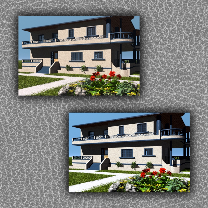
The top image is the original render and the bottom is the fade corrected version. Which do we like best and why?
Loading unique views4,028 unverified legacy hits0.0 archived rating2007-03-10 added
Comments 5
A conversation around the artworkSign in to join the conversation.
yes I agree that the leaves look better too, but the difference is more subtle than on the house and sidewalk. For many reasons I really like the effect the fade correction had on this particular scene.
It's the green leaves that make me feel the lower is the better one. The house, being an artificial thing that could be painted in any colour, seems less important for this test.
sun David, you know me well enough to know that I stopped using the default sun many years ago. Thankyou for teaching me that by the way, all those years ago when you did not know who the heck I was because I was silent. There is indeed a second sun at strengh 12 with a slightly reddish hue. In the top render the sunlight color is more obvious. To me the top render looks fine. But next to the bottom one, the top one begins to lack. I had to crank the fade correction up to 100% just to see an effect on the scene. The lighting in the original is much closer to nature than it looks right now. Like an ibl, most of the work was done in bryce so postwork would either ruin the scene or have little effect, in this case, little effect, but still some, especially on the house itself. The color of the house is the most "changed" aspect of the new postworked version. The diffussion is set at 70%, as I was trying to avoid the powerful sun from washing out the house. I could have raised the diffusion to 80% and the lightiness of the bottom one would be matched by the top one. By adding the postwork effect, it added a sense of "heat" to the scene. I feel like I would feel the heat under my feet if I walked on the sidewalk of the bottom one. It feels like I'm really there, where-as the top one feels like a picture or photo.
The lower one. Yes, the face correction goes some way to making up for the weakness of the standard bryce sun. If you use additional lights you can set things up so that face correcting your render has no noticable effect. That's when you know you've done a good job of squeezing the most contrast out of the renderer.
. Fade corrected? Well, I like the bottom one, it looks more realistick. It has less color, and the texture bump map is less visible.