FROM THE COMMUNITY COLLECTION
Back to the seashore
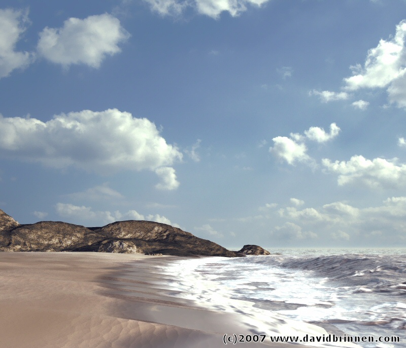
After consideration of the critism of the previous seashore image, I've had another go. Bump has been weakened on the sand and the sand terrain split into three parts, dry sand, wet sand and foam, the transition being handled by very carefully set up blend transparency in the materials chosen. The sea consists of a water plane set to match the foam using a mixtures of ambient, diffusion and reflection. The waves have an altitude sensitive material which is brighter at the base. Mordor was chosen for the wave terrain. The clouds are from a photo (as stated before). Light this time around is provided by a single bright orange yellow "sun" (point light with zero fall off) and a blue light (linear point light) as fill in lighting on the spit of land. If all that sound fiddly, then trust me, it was. Postwork consisted of some colour correction in PSP8 (terracotta colour blended with palette) and salt and pepper filtering to take some of the grain out of the photo image and soften the harshness of some of the material edges.
Comments 6
A conversation around the artworkSign in to join the conversation.
Im in awe!! I love your sky! It is very real. Can't wait to see the finished product. It is beautiful now.
5/5 for sure. I agree with the previous comments. Trully excellent. Flawless. Yes the water receeding from the shore is incredible and could not be better done. Brilliant work. I don't find the foam to be floating too high. I can see shadows from the foam but I think that is very 3d. Even foam casts shadows. This image looks much better in color. The postwork you applied seems to have been just right. I feel warmth. An example of when ibl may not have been the best approach. The warm (yellow / orange) direct sunlight coupled with the blue indirect or secondary light is the winning combo for realism landscaping scenes. Awesome. I cannot imagine a single improvement! Thank you for this incredible piece of wiork!
Simply beautiful! This is more than 5, David, really. I'll have to agree with Spektyr. When printed, this image looks 100% as a photo. No matter the clouds are actually real, they blend so good with the render that one begins to think these clouds are volumetrics made within Bryce. In my opinion the line, where the sand meets the foam is where the CGraphix can be "detected". You did great job there too. As if everything wasn't rendered in Bryce. Excellent!
This is the most beautiful sea-sand transition made in Bryce I've ever seen. The sand looks very realistic, indeed. This is it. You can't improve on this. Of course, the sky is a photograph, but it matches the scene and light flawless, and that's the accomplishment. The 5/5 is well earned. Strange, I felt a stiff breeze when looking at the monochrome picture. This one gives a somewhat calmer impression. This might be due to the rather harsh contrast on the monochrome variant opposed to the warm light in this one.
OH BRAVO!!!!!! You did it! Wet Sand!!!!! And wet water too!!!! hehehe ;-) 5 Stars!!! Too bad I can't give you 6.
. wow, the send to water transition could not have been done better! the ocean is great too, foam looks like its floating up above a litle too high, but thats ok. The only thing that makes this look like a CG image is the texture of those rocks, its just too noisy compared to everything else.