FROM THE COMMUNITY COLLECTION
Kaleidoscopica 3
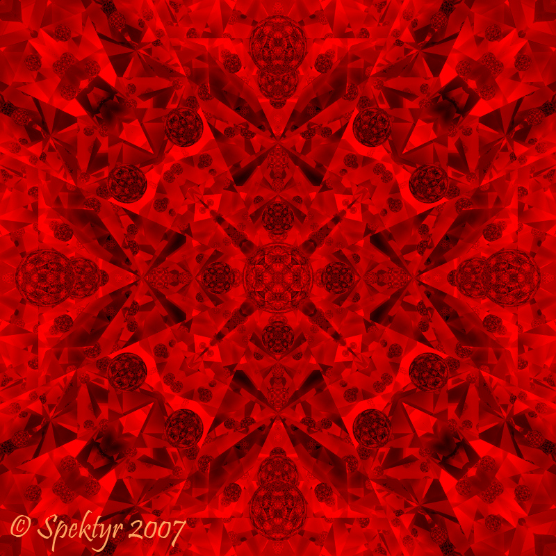
Red this time. Doubled the Ray Depth to 20 and changed camera position again on this one. Only one more. I promise! ;-)
Loading unique views3,396 unverified legacy hits0.0 archived rating2007-05-12 added
Comments 5
A conversation around the artworkSign in to join the conversation.
Yes, the thumbnails do not do these images justice, particulaly this one with the greater level of complexity.
Yeah. With the ray depth at 20 there is so much going on here that it relly 'flattens' the image. Lowering it like in the 3a image (set at 12) brings out more dimentionality. I still like this one because it's kaotic and symmetrical at the same time.
Interesting. Though the Kaleidoscopia2 looks more 3D as an object, we find the 3D-ishness on the 'sub-objects' here. In fact, this is a monochrome picture and this works well here.
Yeah. There is an aweful lot going on in this one. I've posted a revised version at a lower Ray Depth. It's not so 'intense'.
What a difference the ray depth change makes. It looks like perhaps the rays are bouncing around so much that the light intensity feels rather even all around, perhaps too even. I'm not sure how to address that issue if it is indeed one at all. I just find that this one tells a less clear story. It's totally subjective of course. I just wonder what this would look like at a lower ray depth.