FROM THE COMMUNITY COLLECTION
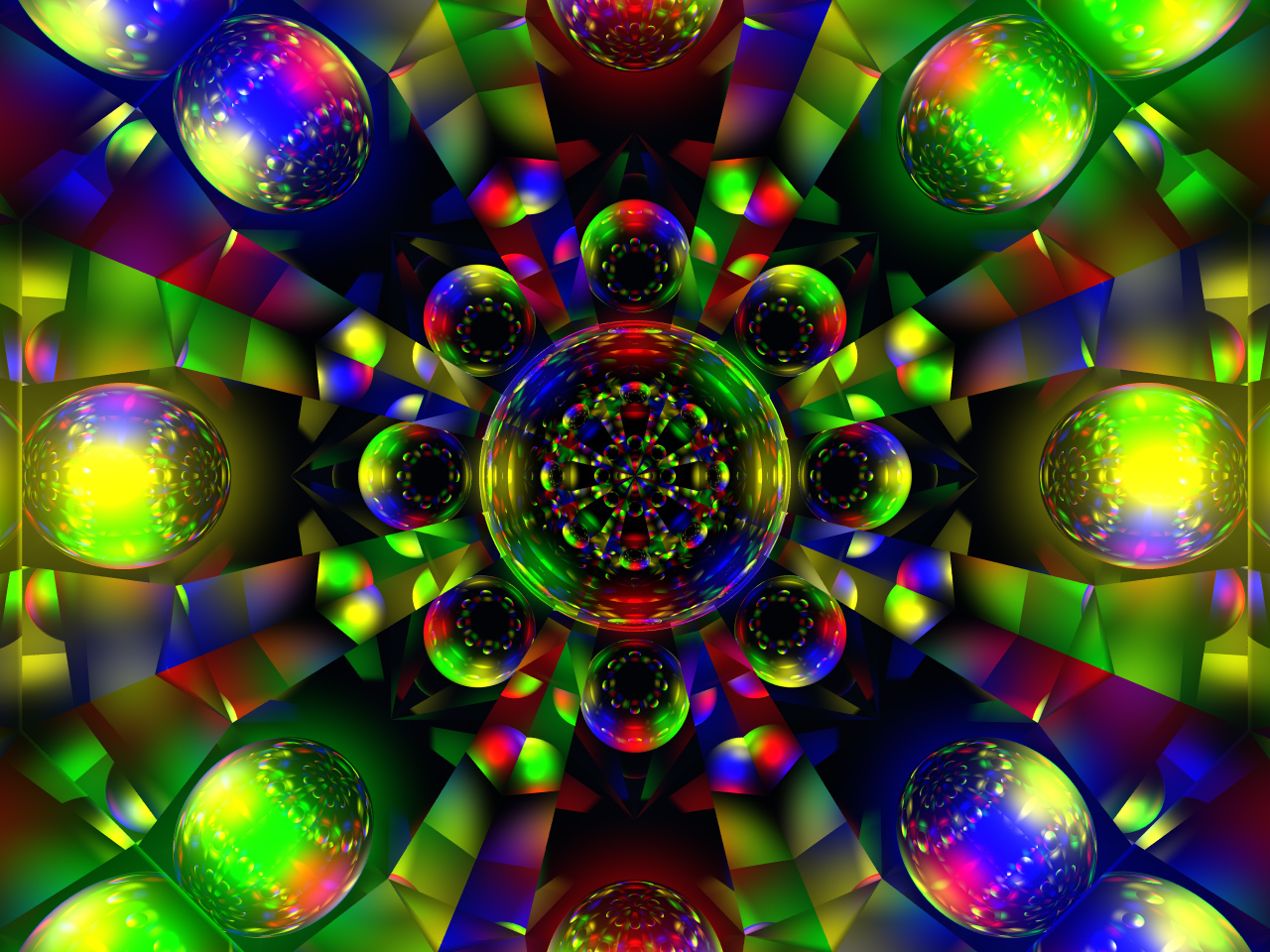
Rainbow Dimensions 2
This is a rendering og the original Rainbow Dimensions 1 at a Ray Depth of 4 and resized to 1280x960. It would make great wallpaper on most systems with the 'stretch' option enabled.
Loading unique views3,316 unverified legacy hits5.0 archived rating2007-05-15 added
Comments 5
A conversation around the artworkSign in to join the conversation.
Very nice! You must like colors also! Wow I like your work alot. I have a harder time doing geometrics than regular still life. You must have quite the imagination. How long does it take you to do one of these pieces?
I have it all set up and saved. :-) I'm going to render a test copy at 15 fps Res: 300x300 Normal AA. Total duration will be 30 seconds. With compression I should be able to post it on my temp site for download. If it looks good I'll render an NTSC compatible copy at 30 fps Res: 720x480 Superfine AA Uncompressed for submission to Odyssey Productions on DVD. I'll let you all know when the test copy is posted.
Note about animation I was just taking a nice hot shower - I do some of my best thinking in the shower - listening to some good music - my latest obsession is The Alan Parsons Project - and I came up with some great ideas for the choreography of this next animation. Get ready for the ballet my freinds. It's going to be a dance of light and color, a true Masterpiece. It will probably take me a while to produce and render this one. I'll keep you all informed. The way I see it this one will be well worth the wait. ;-)
Yes. I agree 100%. As progess with the development of this style I see that lower RD settings are better especially when more mirrored surfaces are used. In Kaleidoscopica I used a pyramid with 5 mirrors. This image has a polygonal construction with 16 triangular mirrors. This one [I]needs[/I] lower RD settings or the reflections get too congested and confusing. This version of the image is much better on the eyes. :-)
Gat was right with his remark for v1. It is much better with the lower RD. Perhaps I'm alone with this idea - nevertheless: I think symetrical things ought to be kept rather simple in order not to get confusing. On the other hand, non-symetrical, chaotic abstracts may be full of details as this start of nibor's appears to prove.