FROM THE COMMUNITY COLLECTION
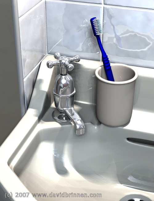
Sink, tap and toothbrush
Models in wings3D lit with Horo's corridor_night.hdr and ten radial lights. I was happy(ish) with this until I went to look at my bathroom sink. Then I was unhappy for two reasons, the first being that my 3D memory of the sink did not match up to the 3D reality of it and that my real sink was much dirtier than I'd imagined also. I was going to put an image up of the sink alongside the render for a comparision, but it really is just too horrible to contemplate. So this is a stage 1. I'm going to try and make a dirtier version.
Counting views…4,340 unverified legacy hits5.0 archived rating2007-07-07 added
Comments (6)
Sign in to join the conversation.
Excellent! Great job David. I wish my bathroom sparkled as much! Looks so real. I do agree with Rashadcarter1 on the toothbrush. It needs more smoothness/shine to it. You definitly earned a 5!
- All's been said already. The most striking thing is the distorted reflection on the tiles. If it were not for adding more dirt, I'd say that one's done. The weakest point is indeed the toothbrush.
- Thanks for the advice. I will do my level best to avoid tranparency with all these lights, but as you say, maybe it will be unavoidable. And as for mapzoneeditor - no I've never seen that before, thanks for the link, I'll have a look!
. oh and the only thing I think needs to be changed is the specularity on the toothbrush, it needs to have all of it and it needs to be hard, so that it looks more like plastic, but I don't know the lighting situation here.
- Let's just start with what's been done right. First, the tiles look great! Love the distorted reflection coming off those tiles. The ceramic material looks great, not too shiny. Toothbrush model looks good but the color saturation is a touch too high for realism. The faucet looks great too. The lighting overall is spectacular, just a touch too bright for ultimate realism. I like the effect of the colored light sources. Somehow the cup and the sink materials appear a bit to similar, I would change up the cup mat a bit. Dirt, is not something bryce has ever done well. I think you've done a great job of it so far. I would suggest working in layers and not trying to do everything with one material. Ceramic on one layer, and then another copy of the mesh layered on top and rigged blend transparency to apply dull dirt where you want it while leaving the ceramic clean and shiny underneath. I say this because if the dirt is shiny it will not look legitimate, as could likely happen if you try to do it all at once. Lastly, I might suggest (I have no idea of how to do it but) that you dress up the room itself a bit to give the reflections a bit more variation is color. These reflective surfaces tend to "take in the room." Enough nitpicking, Great work!
. lol this renderes are starting to look less and less then what is bryce is capable of, really good job dave. Have you herd of map zone? Its free you should try it. http://www.mapzoneeditor.com/