FROM THE COMMUNITY COLLECTION
Illg-Test
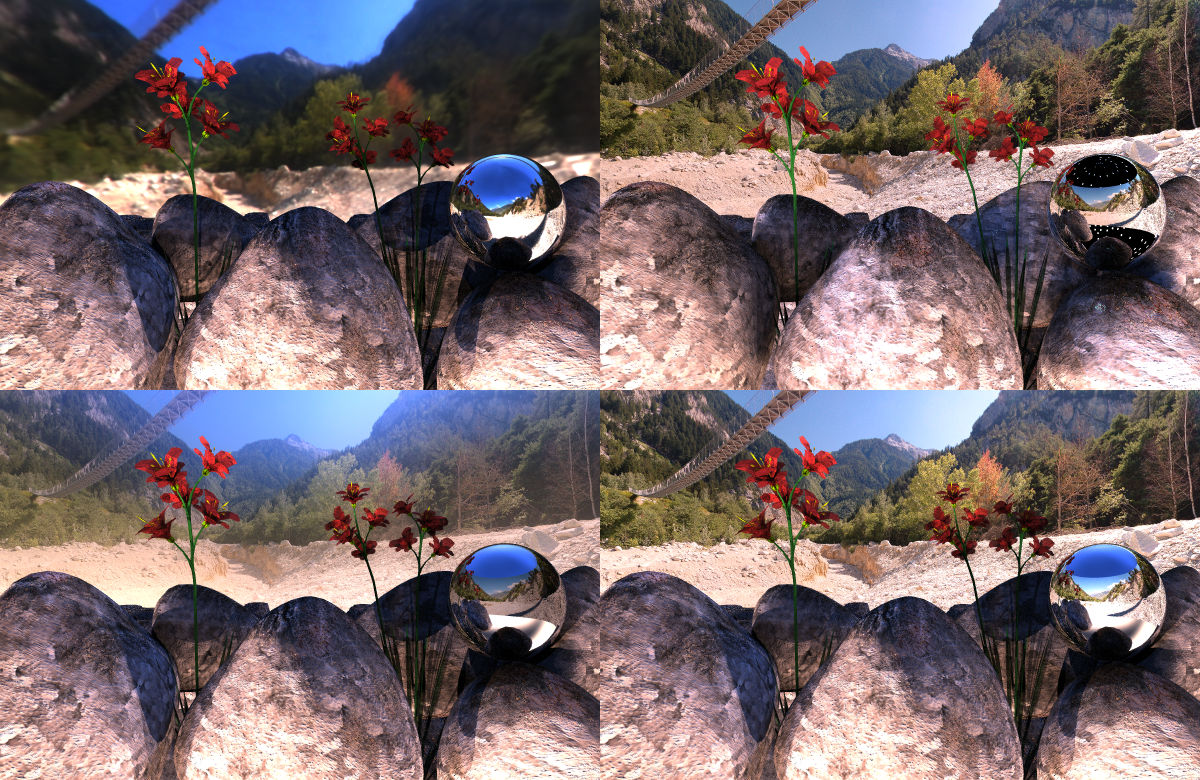
Now why I was not satisfied and why I talked about flaws, here 4 renders of the same scene (bump on boulders changed). Top left: only HDRI rendered as background. Quality 16, Intensity 9.5, HDRI-Effect 80. Renders in 10 minutes. Top right: Cylinder with hi-res panorama, Diffusion 50, no Transparency. HDRI converted to lights only using the median-cut algorithm with 256 lights. Though it doesn't make sense to render the HDRI as background, I did so to show that there are less lights from above than below (see mirror ball). Quality 256, Intensity 9.5, HDRI-Effect 80 at Linear 33. Renders in 1h36m. Bottom left: Cylinder with hi-res panorama, Diffusion 8, Transparency 90. HDRI specular convolved with a Phong exponent of 50, rendered as background. Quality 16, Intensity 9.5, HDRI-Effect 100. Renders in 12 minutes. Looks as if there were a lot of haze around. Bottom right: Cylinder with hi-res panorama, Diffusion 33, Transparency 33. HDRI specular convolved with a Phong exponent of 50, rendered as background. Quality 16, Intensity 9.5, HDRI-Effect 100. Renders in 12 minutes. Looks crisp clear. The lower two renders illuminate the cylindrical panorama from front and from back. The HDRI is aligned, though completely blurred. It gives the light and the colour.
Comments (3)
Sign in to join the conversation.
- You're description is very professional, and I'm afraid to say I don't understand much of it. You appear to be very scientific and well thought out in your works. This appears to be a very well planned showcase and I would have to pick the top right. Although the bottom right is also good because of the late afternoon shadows as gat already mentioned. Also, was placing/rotating the cylinder so that it was in the same positon as the HDRI difficult? It looks as if if would have been hard, but I don't know, maybe there's an easier way. Anyway, very good job and obviously a well planned showcase. Thanks for exploring this topic!
. nononno b right looks best, deeper shadows. But some strange dark places, which makes me wanna say top right is best. Now, maybe use a material to fade the map into sky, or an alpha channel. very nice!
- Very impressive showcase. For me, and it was a difficult decission, I'd say top right looks the "best" - with bottom right being a close second. Top left, hdr as a background, shows the weakness of this feature, too blurred and too distorted. You observed the issue with bottom left yourself - the background looks hazy. I got to give you full marks for this, partly because the images are very good, but mostly because this is such an interesting subject - oh and the rocks look better at this scale. 5/5