FROM THE COMMUNITY COLLECTION
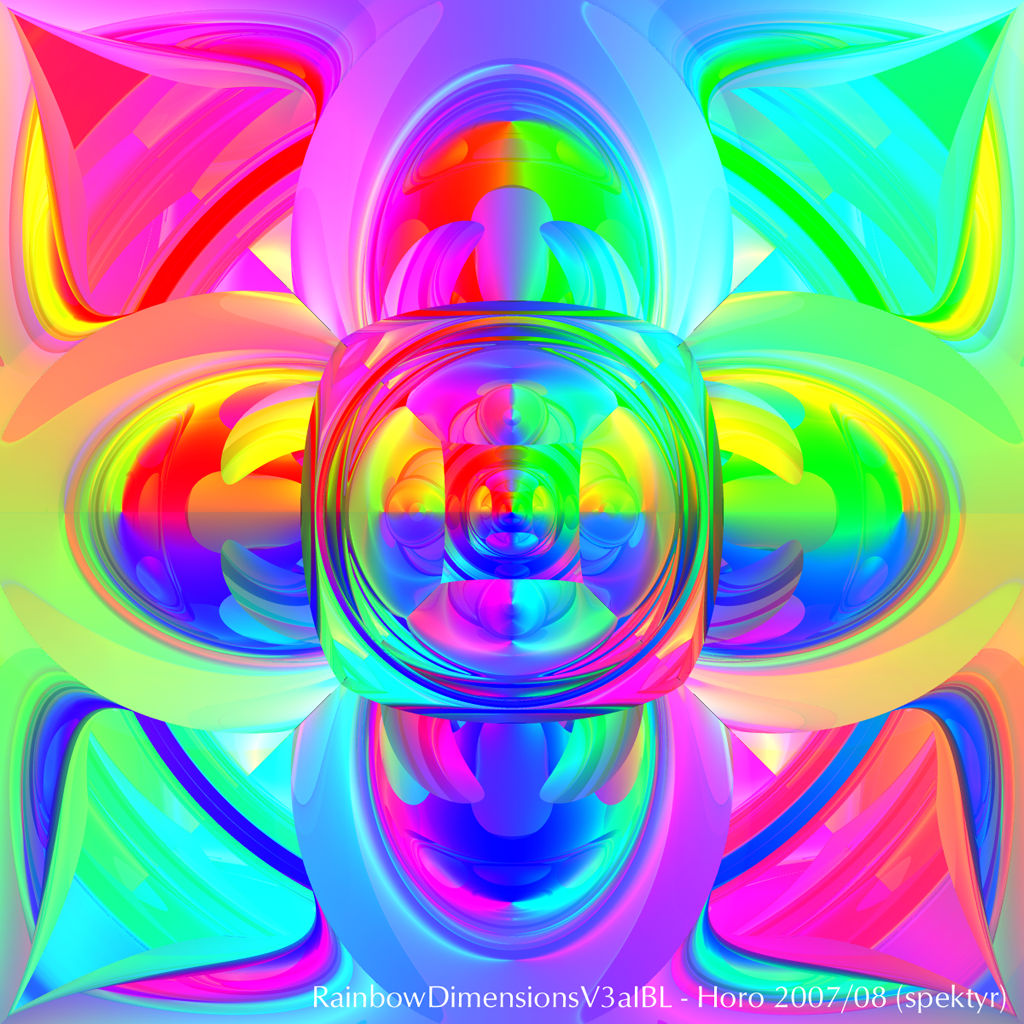
RainbowDimensionsV3aIBL
Spektyr was kind enough to offer the source file for his beautiful RainbowDimensionsV3a. I used it and lit the setup with my Rainbow HDRI. The result is much less beautiful but if you like pastel shades ... What I've changed: removed the 8 spots, decreased Diffusion on the spheres from 30 to 10, increased Transparency from 0 to 10, decreased Refraction from 100 to 60, increased the Max Render Depth from 5 to 9 and set TIR to 2. No premium render, just standard AA-ing. The IBL settings are: Quality 16, Intensity and HDRI-Effect each 14, Falloff Linear 1000. Thanks again Spektyr, this was an interesting experiment for me. Your result is much more superior.
Loading unique views2,996 unverified legacy hits0.0 archived rating2007-08-24 added
Comments 8
A conversation around the artworkSign in to join the conversation.
A little too gaudy for my tastes... The edges of the central square look best to my eye, so I think what is needed here is a little attenuation, maybe use a slightly tinted mirror material so that a greater range of luminence is presented. Of course that is a matter of taste and you are entitled to dissagree. But that's my two pennorth.
But I would, Horo. The light transition helps a lot to the contrast to pop-up in this image. Adding tir, could raise the "glass" feel to the max. Both yours and Spektyr's version are looking good. I'd prefer to see some other, colder color nuances here. The rainbow look is nice, although a little trivial. I wonder what Spektyr has to offer in his next work on this image.
TIR Yeah, reckon it doesn't here. I have a habit of defining the TIR value whenever I use transparencies. It does sometimes help to make the render time shorter. Though the pastels are nice in their own way, mine is 2D-ish while yours is 3D-ish. In this case, contrast could be controlled by the refraction settings, something you wouldn't expect in the first place.
Horo: It doesn't look like TIR has any effect in these images. I'm rendering a new one with different camera and target positions at an RD of 9. This one will be brighter, more complex and has a greater dimensionality. It has nice pastel shades too. ;-)
. Very nice colors, I like the caleidoscopic glass, maybe with a little contrast looks better, but good job
OMG!!!! TOO BRIGHT!!! MY EYES!!!! LOL Dear Lord! It [I]is[/I] an interesting effect but the intesity is off the scale! As for pushing the RD up, I tried that but it started becoming too complex. I settled for 5. I haven't played with the TIR yet. That's an interesting idea. ;-) And the pastels [I]are[/I] very nice!
Looks like glass. Nice job.
. It looks different and IBL added some really nice color gradients to this. very nice!