FROM THE COMMUNITY COLLECTION
Asymmetry Version 1
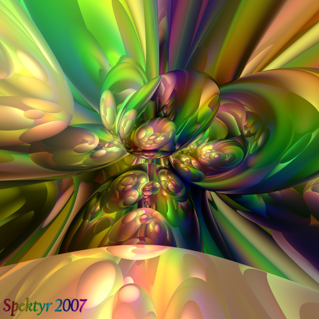
This should be asymmetrical enough for you, eh Horo? ;-) Actually I think it's a bit creapy but that's probably just my imagination seeing things that only It can conjure out of this image. All comments welcome
Loading unique views3,997 unverified legacy hits0.0 archived rating2007-08-27 added
Comments 8
A conversation around the artworkSign in to join the conversation.
Thanks David! I know what you mean. I think it's that organic look combined with the dark areas that make it look spooky to me. The color blending yielded some interesting flesh tones that cry 'Mutation' to me. LOL
Has a vaguely organic look to it, like cells of some kind. Don't forget with reflective spheres there is always the option to try out the "fuzzy" effect - can produce some interesting transitions with that. Once again you've done a very good job with the lighting and the colours, but I don't like this one so much because there is something "gastric" about it that is slightly off putting to me. Still good work!
OH RIGHT! I believe I downloaded tht one once but I never played with it. Thanks for reminding me. ;-)
Thanks Horo and Richter! Until now I've been working with symmetrical designs exclusivly. What I've done here feels like I'm moving out of a sane and orderly world into a dark chaotic realm of madness. I must tread carefully here. There's no telling what nightmares I might unleash from the bottomless abyss of my psyche. EXCITING, isn't it? ;-) Richter- I have the FOV set at 180 for most of these images. The fisheye effect is part of what creates the patterns. It's one of the more clever ideas I came up with while evolving my technique. And thanks for the kudo on my signature. The 3d characters are actually created in Carrara, given a glass mat and illuminated in Bryce them applied to the image in Photoshop. The only problem is the bevelling in Carrara often deforms the characters too much so I can't use just any font. It's irritating but I'll have to deal with it until I find a better way of creating the characters.
I've checked them all so far, and I'm a lot more into the spherical shapes then the angular. In other words I like this one best! I love the dark places here in the image which I missed in some of your previous works. A little bit of brown, some black and dark blue, mixed together make the fairy-tale true :) Did you played with fov also, it looks like so. Amazing results overall in my opinion. And yes, good going with the new logo, Spektyr.
Yes, this adds tension a completely symmetrical picture misses. It's probably the colours that help givin it a bit of a creepy appearance. I also see some funny things.
I know. I'm just getting started. ;-)
. I doubt there is a way to get too much a symmetry considering this is software, and there are multiple reflections, but I have scene some cool results done using toruses and spheres.