FROM THE COMMUNITY COLLECTION
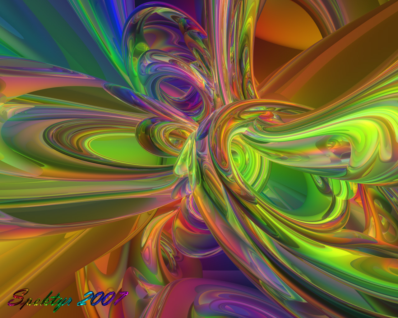
Rainbow Chaos 2
Same setup with things reoriented. I like asymmetrical! :-) All comments welcome. Note: One bad thing about LCD panels is that sometimes it's hard to tell weather an image has aliasing. This image was rendered superfine but it doesn't look right on this display. Please let me know if it's ok for you. Thanks.
Loading unique views3,812 unverified legacy hits5.0 archived rating2007-08-28 added
Comments 8
A conversation around the artworkSign in to join the conversation.
Beautiful! I love this one alot! You are so good at your designs. Your work reminds me of the posters I use to see back in the late 60's early 70's. I think the term used for them was farout! Im showing my age again. Oh well ; ) Great job Spektyr! You get my vote again.
David- I quite understand that everyone has preferences and I would never take your statement as criticism. Even if you did critique my work I would view it as valuable advice to be seriously considered. :-)
Hmn... I struggle with abstracts. I think I prefer the symetrical ones - but these are good too. So don't take that as a criticism of your asymetric abstracts, that's just my personal preference. Good work.
What a bunch of critics. So I have one torus interecting with another. Nobody's perfect.....dispite what my ego thinks. No, he's not going to interupt anymore. I severed his virtual vocal cords. ;-) Seriously though, I took a break today. I didn't get much sleep last night and I've been feeling out of sorts all day. I think I'll just go to bed early and try to get a decent night's sleep. You guys can continue searching for flaws. I expect a detailed report in the morning. ;-p
I know what you mean with LCD screens. I was reluctant to replace my 21" CRT by a 23" widescreen LCD. But they have improved. The LCD on the old laptop is useless for that kind of pictures. Yes, there is a cut shape visible and this disturbs the flow of the eye when exploring the picture.
. they all are looking good, but those cut of lines in the shapes are a bit out of place, I think those are from the reflection box? also, try using metaballs too.
Thanks Richter! So far I've been reluctant to use any Premium functions because they slow things down and I've wanted to get these out quickly. I realize I'm kind of 'flooding' and so I'm going to slow down a bit. I'll experiment with the Premium stuff for my next piece. Can't wait to see your new image. ;-)
It's quite fine the AA on this one. I see you have this abstract "fever". I can tell you it's contagious :) Right now I'm rendering something new and a bit abstract. I'm unaware of your pc system spectifications, but I have a suggestion. Why don't you bring a little more complex shapes into scene and play with some values in the Premium render options such as blurry reflections or transmissions, to "break" the variations I mean. I think it'll be awesome. The "bad" comes when rendering at higher then 1600x resotlution. That's why I say it is just a suggestion. Maybe you'll give it a try.