FROM THE COMMUNITY COLLECTION
3 Characters 4
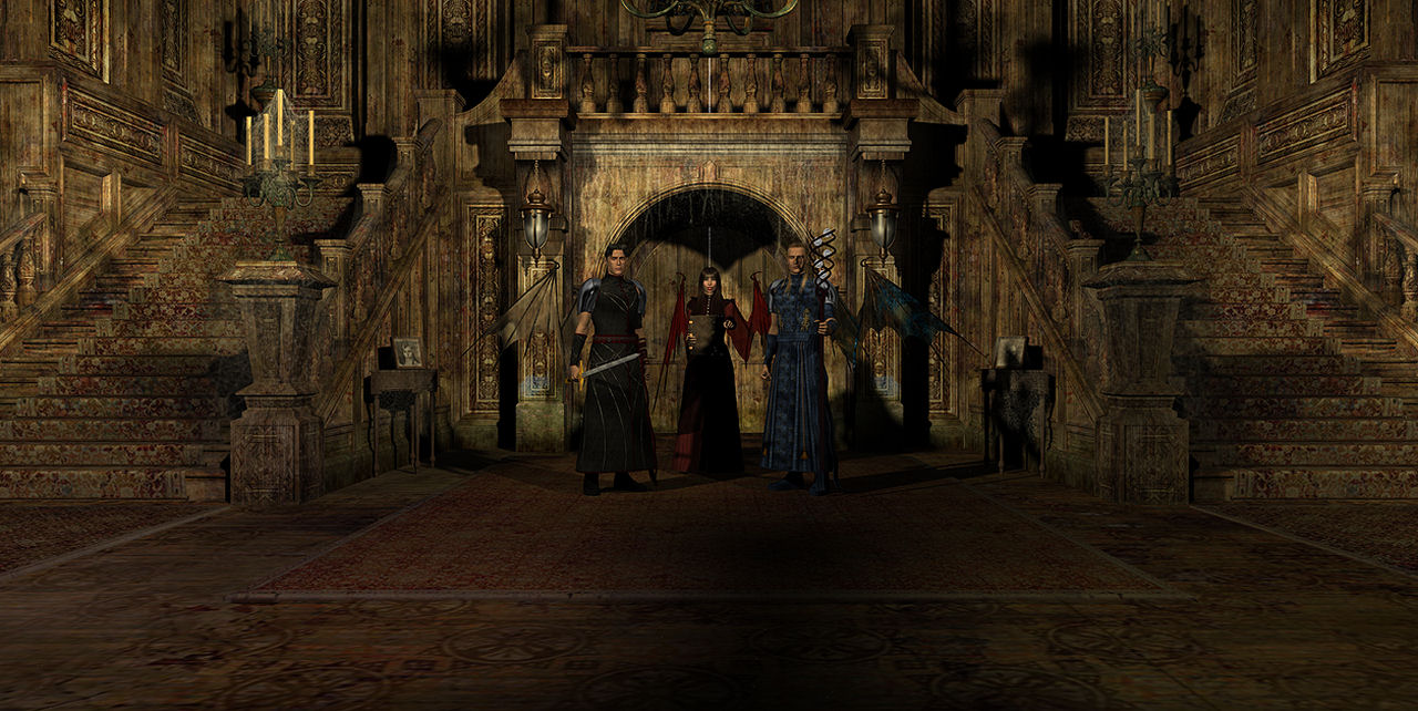
Ok here is another render. Hopefully this is a bit better. Still working on it. Also I would think the light is coming from a large round window on the far wall. That's what it looks like to me. I didn't change the lights just added the shadow option. I need to move the staff a bit more since it's shadow is falling on the character's face. Not what I wanted.
Loading unique views56,763 unverified legacy hits5.0 archived rating2007-09-05 added
Comments 10
A conversation around the artworkSign in to join the conversation.
Much better! A closeup view of the characters would be good as well.
Thanks I'm not completely happy with this one, but I will leave it as it is, and work on the next pic.
* Wow its been a while! It is nice to have you back. You did a great job here. There is so much detail here.The lighting looks pretty good, it helps to make the house creepy. You earned a 5.
Holy, this image looks great! The charters and texture blends so well. Its got that moon light haunted look.
Alex, you really did it this time! As if I'm playing Clive Barker's Undying (one of my favorite games ever). The textures and the lighting are so much great. There's this big shadow on the floor right in front of the characters. Now I really wonder what are those characters looking at. With a sword in his hand, the left one is deffinately ready for a battle. Considering the huge difference between this image and the previous one, I've got to give you full marks. The mood is increadible. Don't give up, the improvement is more then noticable!
- Thanks - It took one hour to render. . . I think. LOL it was real late so I'm not sure. As for the ground it is the one that came with the forsaken package, and I have no idea how to retexture stuff in studio yet. I will check the templates and see what I can come up with since I have paint shop pro 10.
There's no stopping you now. Very impressive work in Daz studio. How long was the render time? This scene is very detailed and you know exactly what to do with it. Great job!
Considederably improved over the last example. The lighting is certainly getting there. This render still seems somehow a little "flat" - I can't quite put my finger on it, maybe the floor materials could do with some bump?
. I think this looks much better, I like it more than last one, good job
You added a lot of drama here. Great improvement.