FROM THE COMMUNITY COLLECTION
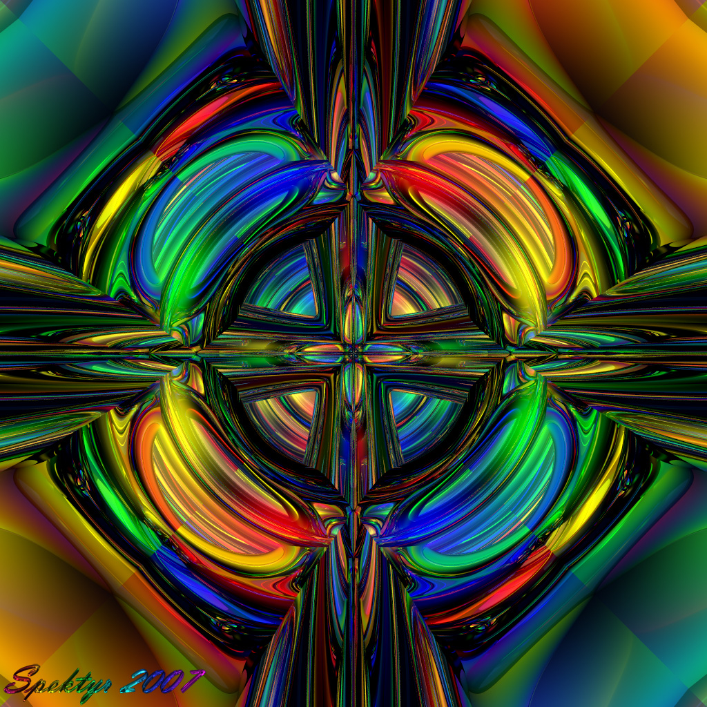
Rainbow Dimensions Version 5a
When I did 'Descent Into Madness' I was actually experimenting with high Specularity values combined with low Diffusion values in order to give the image a higher contrast and shinier look. That image was born of low chaotic emotions and even though I'm not going to delete it I don't like it much. It's charged with too much of my darker self, a side I don't like showing. In order to balance out the negative energy in that image I've used the same techniques with a symmetrical setup and created this image. It too has dark areas but they serve to accentuate the bright colors and the overall symmetry is quite pleasing to me. Then there's the mixing of complexity and simplicity that further balances it. This image more accurately represents the part of myself I like to show. :-) All comments welcome.
Comments 4
A conversation around the artworkSign in to join the conversation.
I have to agree Spek', this one is dynamite! Brilliant!
OOOOOhhhh! This is beautiful! Wow! I really love this one. Your work just grabs me a pulls me in. It is almost hypnotizing. Keep up the awesome work. 5 all day long.
Very nice. I like the high contrast. The edges of the mirror box are very obvious from corner to opposite corner. I didn't like that on the first glance, but looking at it longer, it gives it a checkerboard sort of quality that is at 45? to the main symetry. Intentional or not, this adds charm.
. I like order, especially where there is chaos, nice job! I would however consider making another thig. this one is too colorful and takes away from the image. You should also really consider putting this images into frames.