FROM THE COMMUNITY COLLECTION
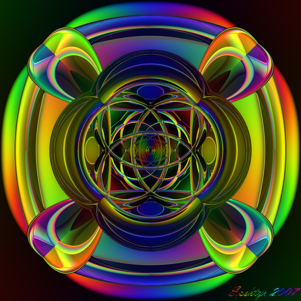
Rainbow Dimensions 7a
Here's a colorful new one to brighten everyone's day, if your day needs any brightening that is. If not then I trust you'll like it anyway. ;-) Comments?
Loading unique views3,920 unverified legacy hits5.0 archived rating2007-10-06 added
Comments 6
A conversation around the artworkSign in to join the conversation.
Thanks David! I need to render it larger to get rid of the aliasing in the fine details and the banding in the outside areas.
Like a mandala, entirely suitable for meditation, stare at it long enough and a feeling of depth and space will surely arise.
I was just going for something bright and cheerful. ;-) This is a new experiment using 4 flattened toruses tilted 45 degrees and then rotated 90, 180, 270 and 360 degrees respectively. It results in a pleasing pattern with nice color blending that I wouldn't mind hanging on my wall. :-) I haven't played too much with the RPP setting. This one is rendered at RD 3, to keep it simple, with the rest of the render settings at default. I see your point on doing a larger render and then sizing it down. I'll give it a try some time. Right now I have to ponder some new animation ideas concerning the suggestion that Gat made. I'll be honest and say it would flip me out if I actually succeeded there. LOL
Nice and colourful, but somehow flat. Beautiful but not my favourite. I wouldn't use the word boring, it were too strong but unspectacular. My feelings after scrutinizing it for a while. There's nothing new comming when I look at it for some time. I've seen all at the first glance. The pixelations, most prominent on the upper right and lower left are also visible on a CRT, however a bit less so than on a LCD because of the AA-effect of the phosphore dots on the CRT. I had that, too, on some renders. There are 2 options: render it twice or trice as large or use SuperFine render. Sometimes, 16 rays will suffice, sometimes you've got to go to 64.
Thank you Tina! I think this one is the most beautiful one I've done so far. :-) I think see what you're talking about with the rendering problem. I can see it on this LCD display and this is not the first time. I think it has something to do with the pixels on the screen making very fine details look like they are aliased. Let me know if you are viewing it on an LCD. Ok? It seems there is some banding around the outside the main part of the image. I'm not sure why that happened. I've seen it before on other images posted here. If someone out there knows what causes this please post a brief explanation for me. Thanks.
WOW!!!!! This is beautiful Spektyr! Wow! Reminds me of my Whirlitzer juke-box. I gave you a 5 of course! I do have a question though. The fine lines along the outside of the clover, or what ever the thing is in the center, why don't they look like they were rendered? Is it because of the colors? It is even on the outside of the second outer circle. This is not a critique! Maybe it's just my eyes, but I see dotted lines. Does this make any sense? : ) Great job!