thank you
thanks for the tips i am going to try this tommarow on mw day off so please expect a nother wine glass and i think i am going to make one or even 2 more pics thanks again for the tips and david is there if there is anything i can do to help you with this web site let me know
DA
davidbrinnenArchived
Boolean wine glass
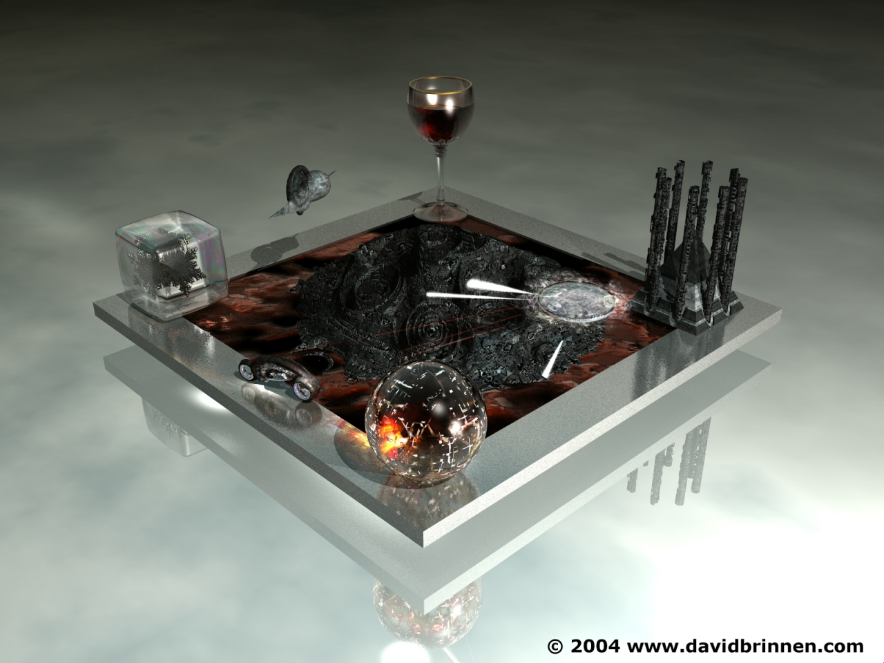
The base is a cone with a torus subtracted from it - flattened. The stem is a clynder with a torus subtracted from it - stretched. The bowl is a sphere with another slightly smaller sphere subtracted from it stretched a bit and chopped with a clynder. Three donuts added to the stem and a gold rim in similar fashion as bowl but with more cutting. Cut glass effect a slope sensitive texture - hand crafted. Easy :o)
GW
GWYDION16Archived
?TION 4 U
Hello, just to start of this is a great picture. My question HOW DID YOU MAKE SUCH A DAME GOOD WINE GLASS AND CAN YOU SEND HE THAT BLUE PRINT SO I CAN LEARN HOW TO DO THAT
FR
FrozencryArchived
Thanks
Thanks for the answers, i'm going to test one of my latest images of how you render your images, and i'll see if I can get it to a similar quality as your images :)
DA
davidbrinnenArchived
42
Thank you for your kind comments. Let me see if I can answer your questions. I render all my images at 1600x1200 resolution mostly with standard AA and 48bit dithering. I don?t use the higher quality renders very often because they tie my machine up for too long. I reduce the size of the image in psp7 to whatever I need, and I feel this may also have the effect of making the image seem a little sharper, I also tinker with the contrast, colour temperature and so forth at this stage which is where the extra colour depth provided by the dithering pays off since it disguises any nasty
banding effects which sometimes result from adjusting the gamma. Other than that I just spend alot of time messing around with the sky editor, building custom materials and frequently use additional lighting. Thanks again for your kind comments and I hope this answers your questions.
FR
FrozencryArchived
I can't seem to figure it out
David your works are all stunning, and by far you're my favourite artist on this site, but there's one thing which i've noticed and I can't seem to figure out. Your images come out so polished and high quality like, and it looks so different from a render which I would do for example on highest quality possible.I mean it almost looks like it's a render from Maia or 3DS Max. I'm just wondering, do you do any improvements in colour or contrast on programs such as psp 7 or ps7? I can't put my finger of the differences between your images and everyone elses renders, i've compared so many times yet I can't seem to put my finger on it. Your images come out so much more polished somehow. It's either me, or you're doing something to make your images look that much nicer :) This image is great btw, i've seen it on your site, very nice.
Comments 6
A conversation around the artworkSign in to join the conversation.
thank you thanks for the tips i am going to try this tommarow on mw day off so please expect a nother wine glass and i think i am going to make one or even 2 more pics thanks again for the tips and david is there if there is anything i can do to help you with this web site let me know
Boolean wine glass The base is a cone with a torus subtracted from it - flattened. The stem is a clynder with a torus subtracted from it - stretched. The bowl is a sphere with another slightly smaller sphere subtracted from it stretched a bit and chopped with a clynder. Three donuts added to the stem and a gold rim in similar fashion as bowl but with more cutting. Cut glass effect a slope sensitive texture - hand crafted. Easy :o)
?TION 4 U Hello, just to start of this is a great picture. My question HOW DID YOU MAKE SUCH A DAME GOOD WINE GLASS AND CAN YOU SEND HE THAT BLUE PRINT SO I CAN LEARN HOW TO DO THAT
Thanks Thanks for the answers, i'm going to test one of my latest images of how you render your images, and i'll see if I can get it to a similar quality as your images :)
42 Thank you for your kind comments. Let me see if I can answer your questions. I render all my images at 1600x1200 resolution mostly with standard AA and 48bit dithering. I don?t use the higher quality renders very often because they tie my machine up for too long. I reduce the size of the image in psp7 to whatever I need, and I feel this may also have the effect of making the image seem a little sharper, I also tinker with the contrast, colour temperature and so forth at this stage which is where the extra colour depth provided by the dithering pays off since it disguises any nasty banding effects which sometimes result from adjusting the gamma. Other than that I just spend alot of time messing around with the sky editor, building custom materials and frequently use additional lighting. Thanks again for your kind comments and I hope this answers your questions.
I can't seem to figure it out David your works are all stunning, and by far you're my favourite artist on this site, but there's one thing which i've noticed and I can't seem to figure out. Your images come out so polished and high quality like, and it looks so different from a render which I would do for example on highest quality possible.I mean it almost looks like it's a render from Maia or 3DS Max. I'm just wondering, do you do any improvements in colour or contrast on programs such as psp 7 or ps7? I can't put my finger of the differences between your images and everyone elses renders, i've compared so many times yet I can't seem to put my finger on it. Your images come out so much more polished somehow. It's either me, or you're doing something to make your images look that much nicer :) This image is great btw, i've seen it on your site, very nice.