FROM THE COMMUNITY COLLECTION
Ignored
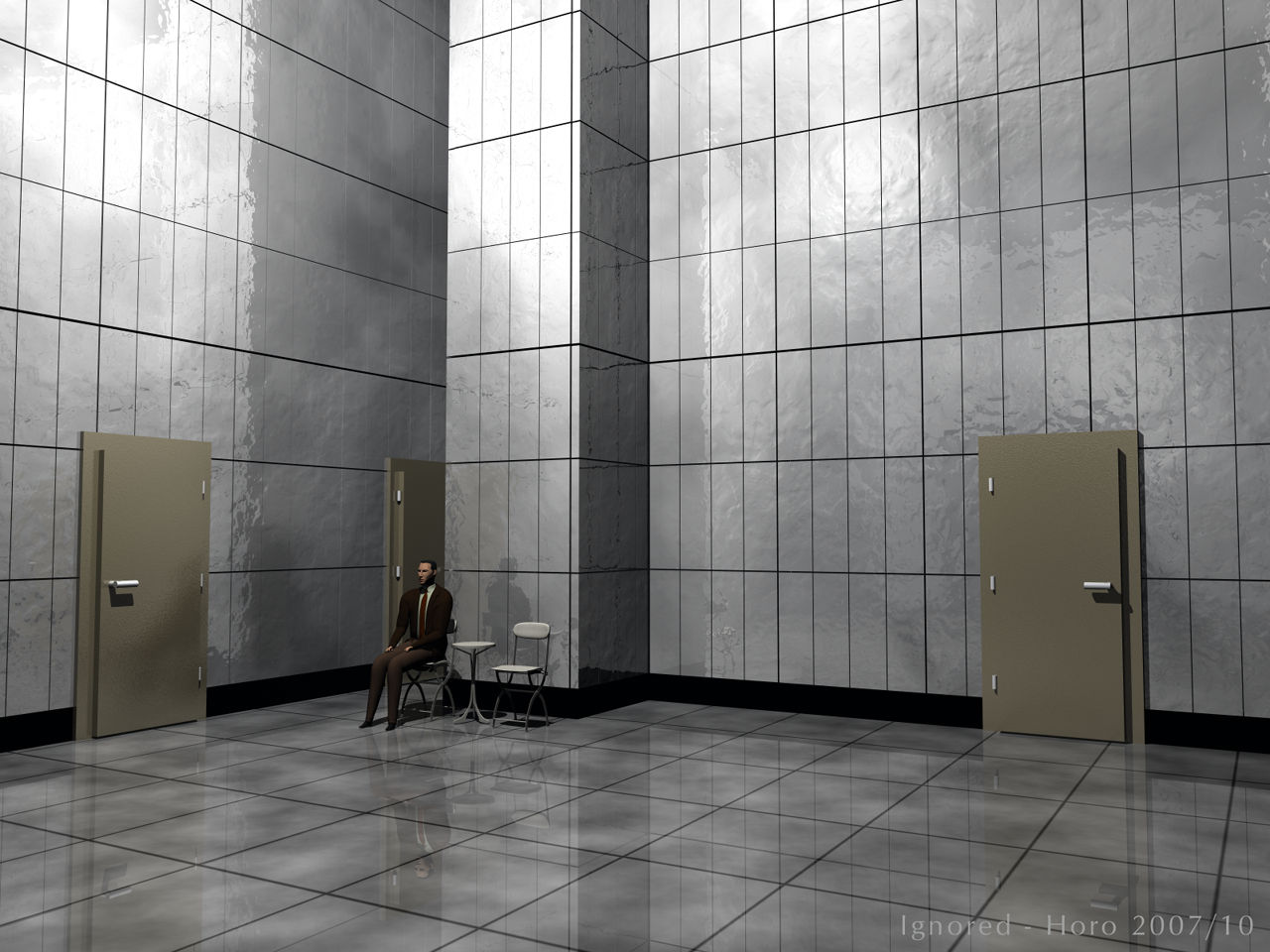
The biz-man is from DAZ3D, I don't remember where I've got the chairs and the table from. The tiles on the wall are cubes, the doors were made with Bryce primitives and the floor is just the ground plane. Lit by a single radial light. Rendered with 64 rays to get the tile seams clean. The time to render was probably much shorter than the patience with which this chap has been waiting in vain and has proudly ignored to be ignored.
Loading unique views4,138 unverified legacy hits5.0 archived rating2007-10-25 added
Comments 7
A conversation around the artworkSign in to join the conversation.
They remind me of vault doors. An electronic lock keypad would fit them just right. Put the guy in a Security uniform and replace the table with a desk, making the scene look like some high security storage area, at Area 51 perhaps. ;-)
Mhmm, massive doors there. But the height is just right. At first I thought those to be vault-doors. Excellent levels of reflection indeed, everywhere! Sometimes the use of cubes for tiling-work works much more efficient then relying on a texture or material with the same pattern. This way you can freely distort the tiling (if needed) here and there to make that part of the scene more natural, in other words - you have 100% more control where you want it and how you want it. Here apparently such actions is "compensated" by the use of those sweet bumpy reflections on the walls. I like them a lot!
Agreed fully with all above comments, looks great. Reflections are awesome, even the doors have reflections. To be honest, it is the reflections that make just a single light source sufficient. The reflections correct the shadows and create a radiosity similation quite well. The daz business man is a joke in and of itself, an obvious cartoon approach. To have rigged a mIchael or David and clothed him would have turned this scene into something else entirely.
Thank you all. There is no point you are missing, Lito, you and gat rightly point at the misproportioned biz-man. I could adjust the head, at least. I chose him because it is a cheap model in the sense of being fully dressed and thought I could get away with it because he is small. And yes, David, the doors are a bit on the crude side. Balancing specularity and reflection for the tiled walls and positioning the single radial was not as straightforward as I anticipated. But I'm equally pleased with the result as Lito. Mind you, the shadows were set to 80%, which would usually give quite dark shadows.
Appart from the doors being a bit "heavy" would be my only criticism of this scene. Otherwise, everything works. Just the right level of reflection. Well done 5/5 On a curious side note, take a look at the image I'm about to upload and see if you are struck by any similarities.
The lighting is very pleasing- the reflections do a great job of disguising those black shadows that sometimes appear with only one light, and the absence of any other light makes it really feel like an office. I have to agree with gat, though, the buisnessman is the weakest part of your scene. With tiny feet and hands, and massive shoulders, he almost looks like a caricature. Which could be the point, maybe I'm missing something here...
. excellent lighting, I think the worst thing in this image is the DAZ business man, the model sucks , very disproportionate. I guess anyone who would be working in a place like this would be disproportionate as well :/