FROM THE COMMUNITY COLLECTION
Open Cell
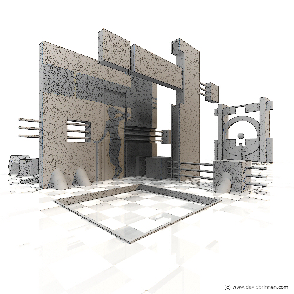
Inspired by Horo's Lobby, I felt I really aught to have a go at some interiors - a subject I've rather neglected to date. And remains neglected. I got so far towards building my room when my imagination took me off at a tangent. I'd slipped V4 off set to speed up the render time, but then got idea's about doing something with her shadow. And so the scene evolved in different directions from what was planned because I'd decided to work with the shadows of things I needed a more open geometry to let in the light. The scene was rendered with Horo's jeeprobe.hdr at quality 16 and premium soft shadows (also 16). The bryce sun was used to generate the crisp shadow of Vicki. I took the rendered image and processed it to get a line drawing (additional noise came by the subsition of the default grey material with a slightly wrinkly grey) the line drawing version was then recombined in PSP8 with a mask to give the effect that the edges of the image are fading out into a pencil drawing - sort of idea.
Comments 8
A conversation around the artworkSign in to join the conversation.
AH! Cartoon time! Love the invisible woman! ;-) Is that a trap door in the floor? I wonder where that will drop me too. WAIT! I got it! That's where the lady went! She dropped through so fast it left her shadow behind. I just love the way anything can happen in a cartoon. :-)
Neveroiatno (a bulgarian word for "unbelievably good")! Very innovative style of work. 2D and 3D at the same time without loosing anything specifically related to the two types of art creation. Nothing is too much, yet again there isn't anything missing. Intended or not - your pure geometry finish of this piece did affect even the render resolution 1k x 1k. Building around something or someone (as your case here) reminded me of tales I read long ago about people building temples or incrustated walls around monuments/statues in order to guard them or hide them. Funny - your Vicky Was actually hidden while all the building went around her shadow. Your "happy accident", as you say, is most inspiring, David! Top vote from me too!
I had not anticipated such high praize for this image. Not that I mind. Obviously. Thanks! Vicky, Tina, is just out of shot on the right of the camera. To explain how the image came about more closely, I began with the wall on the left, in front of which I put Vicki - this slowed the render down quite a bit because of her hair (having transparancies and using hdr lighting = slow render) so I shoved her off to one side, but so as to remind myself where I was putting her, I arranged her so her shadow was marking the place where I had had her positioned. That is how come she fits into the shadows of the geometries, because I kinda built up the scene around her shadow. Happy accident. I am pleased that the brown light was appreciated, I did go to some trouble trying to select the right colour, as Rashad suggested, white and blue sterelised the scene, red didn't seem to offer enough contrast and green I just couldn't get on with. The chequed floor was introduced into the scene and then lit to the point where it was burned out completey, this way, introduction of shadow casting structures within the scene also "created" islands of chequed floor around them - I particularly liked this effect as it did not require me to manually fade the images to the edge of the scene in post. Incidentally, I had not constructed a back story for this image, so if it pleases you to believe Rashads unhappy tale of the lonely and obsessed architech, then go ahead and do so by all means!
I must say David, it is a true joy and benefit to me to be able to communicate over fiber optics with an artist who takes the kinds of risks you take. More than one of my friends who I have visit this site comment on how well you handle so many different types of scenarios. You really jump out there and because of it you reap staggering rewards. I did not comment at first for I was not sure what to say, but after some thought I can render some feedback. The idea of mixing a hand-drawn feel with a Cg render is really interesting. along with that is this idea of shading. The shadows as mentioned are very well thought out. But the lighting in general is really splendid and specific. I like the warm color you assigned to the light, for with this white background and greyscale structuring, a white or blue colored light would have sterilized the scene. The warmth of the tan light is very inviting. For a second I got the feeling that this was a scene about an architect that can't stop thinking about this one particular girl. The idea of her even crops up in his cad works, almost like he is haunted. Cool piece. I have no idea how you did it but like it for what it is.
now thats pretty cool.
This is a wonderful piece of artwork and very well thought out. Just look at Vicki's shadow - the elbow fits in the shadow of the wall geometry and her hand rests on the colon. The line-drawing style used here is perfect. The background and how the edges blend into the white is just superb. Top ratings!
. awesome, 5/5 really like the geometry. also, you can always try to import this into google's sketch up and play with sketchy edges and shadows.
* Nicely done David. How did you get the shadow of Vickie? Is she in front of the camera? Whatever you did it looks great. I rather like the line drawings. I used to sketch before picking up oil painting. I also like the way you faded out the floor in the foreground. 5/5