FROM THE COMMUNITY COLLECTION
Orbimals
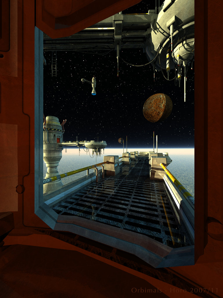
The name means Orbital Terminals. The main model, The Core, is from DAZ3D. The starry sky was made in Universe, in fact, I took the one I used for Alien-Hieve. The moon has a high resolution radar map from Venus applied. There is a red radial inside the main body of each orbital station and a blue one in the nozzle of the far one. Otherwise, the scene is lit by the disappointing RedBlueSun light-probe I made in Bryce. However, it came in handy here because the sun was far too weak. So there is a redish-yellow sun shining from the left and a blueish one shining from the right. Interestingly enough, the bright red square at left does not appear when using 64 or 256 lights (quality), only with 128. The hdri is rotated to 180? and tilted to 27?, intensity is at 2 and effect at 65.
Comments 7
A conversation around the artworkSign in to join the conversation.
; ) i like the wiew throught the window make the scene more realistic
Looks like a scene from a new Halo game. It would be really cool to jump from one platform to another. :-) As you can see I can't wait for Halo 3 for PC. LOL This is an awesome image! 5/5
. it looks awesome, the lighting is too bright in the shadowed areas, but thats ok it still looks believable 5/5
Yeah, this is a really good render. I was bouncing around such an idea in my hean for a while now. of a person in an outer space vessel looking out into the outer space. Excellent lighting choices. It seems the lighting is working much better for the Cores than for the moon. The moon is the only "weakness" if I might go so far as to describe it as such. Richter as usual is very much in tune with the suggestions that come to my mind so no need to repeat. Really fine work here. The sense of scale is phenomenal. The cores are especially well lit Horo. Very Nice work! 5/5
It is so real, My vote is 5
Richter has mentioned just about everthing I would like to say and a few other things too, which I might not have said, but agree with. The moon is the only thing I would like to change in this image (other than adding a figure or two at the end of the gantry) - to me the moon looks a bit too bumpy for something so distant and yes, the shadow too sharp. That being said, the framing of the scene and the arrangement of the elements is pure sci-fi gold, so diservedly a 5/5.
Horo, this work of yours is very good! Excellent results using the Core and the way you placed the models and the camera. I particularly like the placement of the left Core-model, where one can clearly see the fine detail of the bottom of the "bridge" with all those cables and lets say "antennas" against the bright horizon. The red-light and the blue one are also well thought in position and glow-power. Because of the close render, the inner door sides might need a little more detail to them, the texture does its job, of course, but to me only a texture isn't enough here. The reflective metal on the bridge is a touch too much, because it is too obvious at first sight. Metalicity could probably solve the "problem". There is almost no specularity on the Core itself, which makes me think that it isn't made from metal, rather of something plastic. Your stars are great, no qualms there. The shadow on the moon is perhaps too sharp, but it isn't so wrong in my opinion. After all, this moon is very far away, who knows how it's supposed to be. The last thing is the horizon, excellently made with balancing the fog and haze maybe. I think it look even more dramatic if the whole scene were to be tilted a bit to the left or right. This would probably strenghtens the feeling of the Cores being near a planet. Aside with the criticism, what I see could be a 100% shot of a sci-fi cinematic and a perfect director's view. This image could be improved, but I'll vote 5 for it looks very professional.