FROM THE COMMUNITY COLLECTION
Gone4aPee
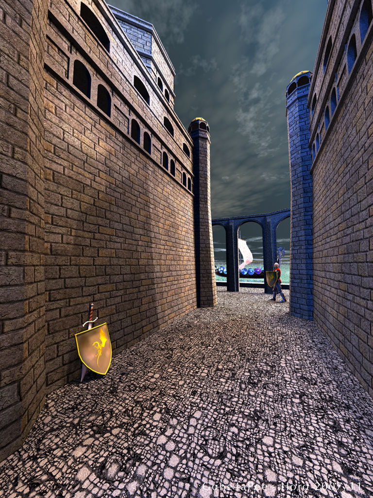
The Groburg, Dakar, knight, shield and sword are from DAZ3D. Lit by my BelowBhutanBridgeSun HDRI, tilted by 90?. The HDRI was subjected to the median-cut algorithm and converted to 256 large lights. When rendered, each of these large lights were assigned 4 lights (quality = 1024) to simmulate light sources with some size. Intensity was set to 35, HDRI-Effect to 15. Rendered Premium with 4 rays per pixel, which took only 60% of the time of a regular render with AA and it finished in around 13 hours. Knights are also humans and feel an urge now and then.
Loading unique views4,324 unverified legacy hits4.5 archived rating2007-11-16 added
Comments 4
A conversation around the artworkSign in to join the conversation.
Image has pleasing colors, but I think it has too much light to make "night in medieval town" mood. Reducing intensity or adding fallof/diameter of the IBL should make it darker. I would also add more objects in the foreground: grass, rocks, dirt and the vine from your previous image on the walls.
The coloured nature of the lighting from the hdr is really one of it's great strengths, not so much, I think because it cannot be done any other way, just that having got loaded the hdr the presence of the coloured light (and critically not being able to subdue those colours - as say a saturation control would allow) forces the artist to explore this effect that perhaps, out of choice, they would have naturally shied away from. Horo has the technical knowledge of the whys and wherefores of the hdr and how the colours and intensities are sampled and how the background (not evident here clearly) is converted so it can be displayed on our ldr monitors. And like Rashad, I've come to recognise that the colours of simulated light do not necessarily seem to match up with the background (source image) as such. I've lost count of the number of hdr's Horo has manufactured on his quest, but it seems there is rarely a good balance to be found between background and lighting. Anyhow to come back to this image, I like the coloured lighting and the overall compositional idea, however I find the busyness of the brick and stone textures a little overpowering and for me undo somewhat the good work of the IBL and tend to disguise the intersting shadow patterns generated by the geometries at play here.
I see. As I follow the links you provided the cause and effect relationship of the image and the lighting become more clear. The blue comes from the sky in the original source photo. The warm colors come from the ground and the green from the vegetation. But I do not feel that I see very much of this particular shade of blue in the source image. Perhaps it is from the deepest part of the sky which is quite blue in nature.
How do you spell relief? I really like the narrow feeling and the way the eye is draw upward toward the sky. The sky seems nice but a touch on the dark side. In the description above you mention some ideas I am not familiar with, such as median cut, and also some sort of light arrangement. It reminded me of the old days of rigging hdri lighting by using gels, or even real lights outside of a transparent sphere colored with an image allowing the light that passes through to be colored by the image. Is this what you mean? The lighting is working really well for the bricks, I love the way ibl really spells out the bumpmapping. There is a strong and highly saturated dark blue light that I do not understand. It seems a bit unnatural though that does not make it bad. The water in the background responds very interestingly to the light also, almost seems to glow. Knight's pose looks really good and natural as a walking rhythm.