FROM THE COMMUNITY COLLECTION
Pentilumicon 2
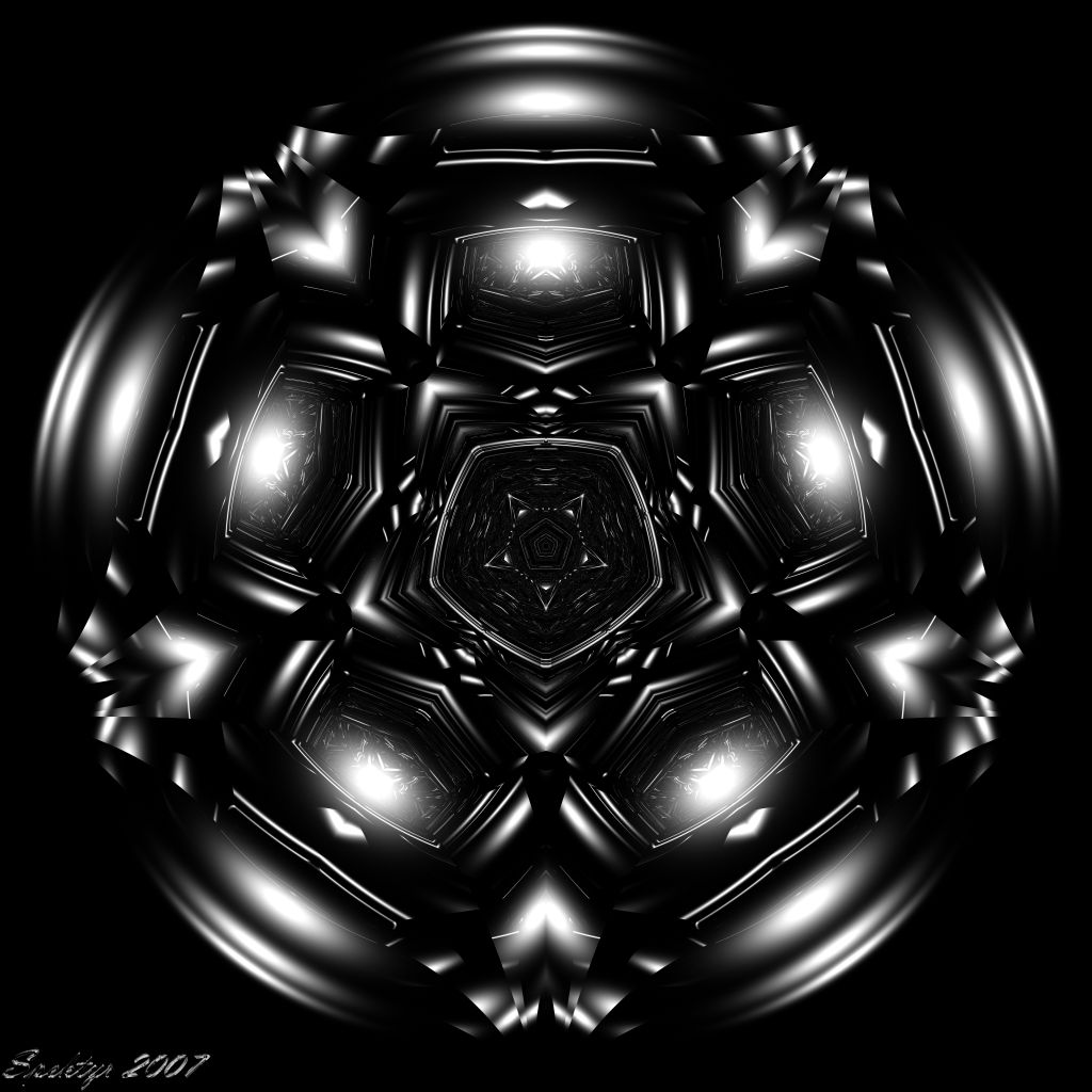
This one was rendered with the same settings as Trilumicon 1. 1024x1024 RD=6 RPP=256 Render Time= 3 Hours 43 Minutes All comments welcome.
Loading unique views3,684 unverified legacy hits0.0 archived rating2007-12-09 added
Comments 5
A conversation around the artworkSign in to join the conversation.
Thanks Tina! Sometimes I find myself exploring in a darker realm. I do enjoy color more. ;-)
* This is quite different for you. It's nice but I so love your colors. : ( You work such magic with them.
Certainly benifits from the higher resolution. Not sure about the ommission of the blue - I think I rather liked that. The centre section is very good, some interesting and subtle detials there. Well done again.
The blue disappered because I set the sky dome to black. I think the geometry of Trilumicon is what makes it more creepy than Pentilumicon. The bright specular spots in the seemingly empty areas is what grabbed me when I did Trilumicon. They almost look like some kind of eyes staring at me.
The blue disappeared. It has a very 3D-ish look. I like the fine patterns in the glowing parts and in the centre. It somehow looks like a strange arrangement of lying kerosene lamps - though the colour of the light is wrong. These Pentilumicons make me less uneasy than Trilumicon did.