FROM THE COMMUNITY COLLECTION
The Sign 2
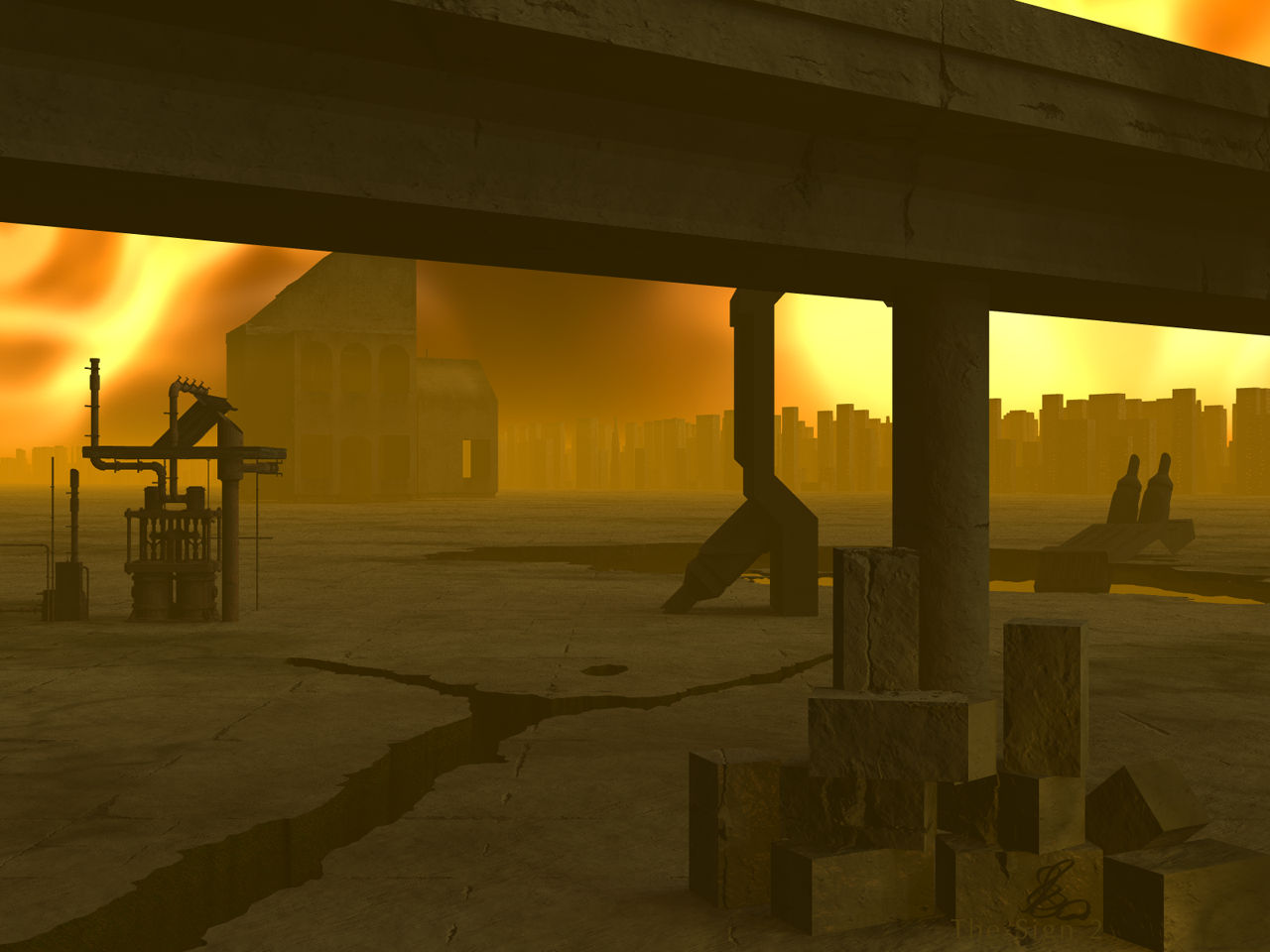
Thank you all for your tips about the city material. The ?Decayed city material? is a beautiful material but most of it gets lost in the mist and light and it is very dark so I took ?Infinite city material? instead, which is brighter. I added the ?Generator? from ?Olympus Mons? (DAZ3D) for more debris but I'm not convinced. I added three concrete blocks and I like them. The IBL quality was halved to 64 to get the shadows a bit more pronounced.
Loading unique views3,711 unverified legacy hits5.0 archived rating2008-01-08 added
Comments 7
A conversation around the artworkSign in to join the conversation.
mmm great i like this pic it's make me frowsen,is it Apocalypse the ambiance is so great i like the sky and the atmosphere good job
The Sign.. interesting piece of art, Horo. I checked the previous one you posted. The new one seems to be improved in a way. I particularly like how the shadows look like here - nicely soft and dispersed as one would expect them to be, excellent concrete texture too. My minor quibbles are with the background city height and the perfect edges of the concr. blocks. I think the city needs to be more randomized in building height going from fairly low roofs at the ends to barely visible skyscraper peaks in the centre (with attention of not loosing the shape in the haze), this way evenly "cut" on the tops, they remind me more of a tightly built futuristic fort towers, which isn't wrong at all actually. Depends on what you were after. About the blocks and their edges, it might have been a good idea to use rounded cubes instead of a razor-sharp-edged default cubes. Of course that is obviously the artist's choice so my words don't need to be taken as a pure 100% criticism, just something to point out. There is something in the placement of the models, the color choices for the lighting and the haze applied which add a lot to the mood of the scene. This scene I percieve more or less as part of a bad dream, a nightmare of sort. That's what makes the scene beautiful in my view. It isn't that easy to achieve such result.
. I agree with whats been said so far, the new texture on the buildings is perfect. I wouldn't, however say that this is a very old place, but an abandoned one for sure. If I was to do something different I would add some form to the flat plane, or at list give it a reason or use for being there.
Aha, scaling might be what is affecting me. As haze and scale go hand in hand, it seemed to me that some objects seemed too deeply embedded in haze for their apprent distance away from the camera. But this was assuming that all scaling issues had been addressed. Now I can see why you would not want to change the haze setting.
Thank you. I did try a less saturated mist, Rashad, but it was not what I was after. There is a lot of empty concrete floor and it is very unnatural, so are the artefacts standing around. This is, what I wanted. But I do have to confess also that I run into a serious scale problem with this setup. A person in the foreground, for example, must not be larger than a concrete block.
I think it looks great. The buildings in the background do not draw attention to themselves anymore. To me the haze seems a bit too much, but that is just me. Perhaps it is more the level of color saturation, perhaps a less saturated yellow like a tan haze would look more natural, though this is a supernatural image so it is not to be bound by the same laws as a "photoreal" image. The inferno background makes me think of the burning wildfires!
Distant buildings do look better thanks to the change in materials. I also approve of the other additions. I still feel that too much of the ground is a bit to unnaturally flat and open, but am prepaired to accept that that is the artists choice. 5/5