FROM THE COMMUNITY COLLECTION
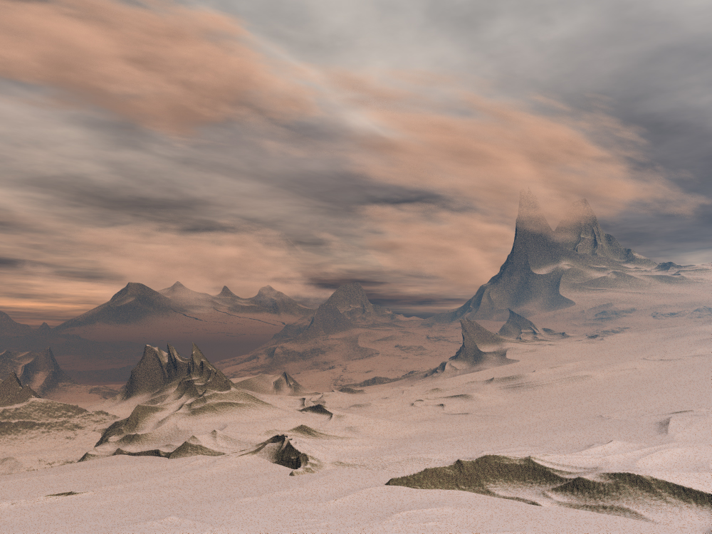
Sand planet
Unknown planet in the m31 gallaxy. Just tried to do some landscaping again. Bryce5, no post. Thanks for watching, bye!
Loading unique views3,776 unverified legacy hits0.0 archived rating2008-02-27 added
FROM THE COMMUNITY COLLECTION
Unknown planet in the m31 gallaxy. Just tried to do some landscaping again. Bryce5, no post. Thanks for watching, bye!
Comments 8
A conversation around the artworkSign in to join the conversation.
. very nice it is all natural looking and very realistic. 5/5
Very good entry! I like it! Your sky is really impressive, Adrian. The only thing I can suggest for the "sand" is to crank up the bump of the material (to some noicable level) if it has any. If the bump seems too coarse you might need to rescale the material or use another terrain if this would affect the rocky peaks.
How embarrassing I could blame this on Horo if i need a scapegoat. Ha I still like the scene but next time just pinch more brown in the sand materials for my sake.
Yes, it suppose to be sand. But it can be easily tranformed into snow if you like. The Andromeda nebula-system has millions an millions of planets circuling all of them stars. And this one is well known as the Sand-planet.... No life on this one.
The title is Sand Planet, so I guess it is sand. I mistakenly took it for snow. Fortunately, the two things look alot alike.
It must be at least 20 below it makes me freeze just to look at it. Very nice the way the snow lays on top of the rocks. I like the how the clouds come down and interact with the terrain.
I'm not sure whether it is sand or snow, but I don't care. Very nice landscape and fitting clouds. Great job. I wouldn't enhance the contrast, the sky doesn't permit it. Great shadow from the clouds in the left middleground.
Once again, you have made every choice perfectly. I love the shapes of the landscape, the lighting, and the texturing. The snow drifts are amazingly real. The cloud layer seems to interact with the top of that mountain, very nice. An evening perhaps. Very fine work here! The only thing I might suggest is that you play around with some contrast filters in postwork if indeed you wanted the image to pop a bit more. Personally I like it as it is, the low contrast goes well with the mood. You are very skilled and it is a pleasure to watch you work!