FROM THE COMMUNITY COLLECTION
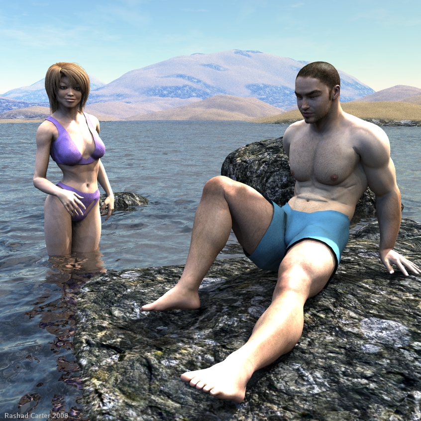
Facing His Fear of Water
Ideally the lighting should be very natural and likely the last thing one notices. Jepe's Pierre texture used on David. Water surface made with terrains tiled and hard crystal setting to give the water a sense of reality. Sunlight provided by a light dome of 80 lights and skylight provided via hdri. Feedback is appreciated. Thanks all.
Loading unique views5,014 unverified legacy hits5.0 archived rating2008-06-13 added
Comments 11
A conversation around the artworkSign in to join the conversation.
Ah Richter, indeed it is a design feature you are observing. It is symmetrical and certainly seems odd to only see one side. The stone mat is slighty blurred as I attempted to resize the texture image for upclose viewing. The scene took about 14 hours to render on my system at 256 ibl quality. I think at 1024 it would be very nice but would probably take 3 days to complete, not sure I want to spend the time but who knows? Ah and the wooden feel may be due to the blue tint of the skylight from this angle. I have revised the hdri with a little bit less saturation. Skin looks corpselike when it is too blue, it is better off with warm colors. Reducing the blue from the sky allows the skin to retain more of its orginal warm color. I have more charcters coming up soon. Thanks for the feedback Richter!!!
Maybe my eyes are just playing tricks on me, but aren't Vicky's bathing "penties" teared a little bit above the left leg? Or maybe it's just the design is meant to be this way, I can't see the other side because of her right hand. Anyway, your water is terrific, very nice and ballanced reflection and transparency, the rock texture/material is also good, maybe slightly on the "blurred" side, but I'm starting to get picky here :) As for the posing - nothing to add, they both seem fine in my opinioin. It is the color of the skin that looks pale and somehow "wooden". One way around this is to higher the contrast and the exposure of the image in PS. Though be careful, because the legs and similar strong lit areas might get too "blown" away. Either make changes while in 3d to the lighting, or just higher the contrast in post. The lighting itself is great, no doubt. You'll benefit from higher quality of the IBL though. Good luck!
Yes, the mix of IBL and transparency is a bit of a nightmare. Your overall lighting looks spot on to me. Terrains and water materials look excellent. The figures to me always look a bit wooden, but I don't hold you responsible for that. 5/5
Renderman, As you explain your insights I must agree that likely it is an IBL quality issue. In this case I used quality 256 meaning only 128 lights are above the horizon. This gives a decent coverage of light but not enough coverage to create adequate soft shadows. Had I the patience to render the scene with 1024 or higher all banding would likely disappear. If it were not for the character hair I would have rendered at a higher quality but the hair is a real drag at high IBL settings. IBL and tranparency do not mix usually. Carrara's skylight is much smoother and does not create much banding and that is one thing I love about Carrara GI.
If you look at Victoria's legs you see what looks like shadows from her arm and fingers but there appears to be multiply shadows or gray areas that don't belong. I really don't know how to explain it but was trying to account for the light gray areas of shadowing in conjunction with the direction the sunlight is casting shadows. But maybe it should look this way. I noticed something similar to this in you Chatty Kathy's scene on the ladies arm in the blue dress. Very light banded gray areas. Not a big deal but was just wondering if anyone else noticed it.
The scene is very plausible and I think he will give it a try eventually, but not today and not here. Let him start with a shallow sandy beach. One little quibble: the ball of the left hand ought to touch the rock. But posing characters is a real challenge. Water and rock are beautiful. There is some shadow banding on the ladies legs. Nevertheless, taking all together, this is superbly done.
The water and the rock are AWESOME!!!!!! Great job on the characters too! :-)
I am revising this one right now. A few ideas have come to me so expect the next one soon.
Thanks Renderman and Adrian for the positive remarks. Renderman I do not quite understand what you are observing with Victoria's legs. Are you talking about the blotchy sort of coloration? I used ibl quality 256 which means there might be some banding. Adrian, the guy has been working out indeed. My thought here was to display a man who is physically very strong and athletic but who is handicapped by his mental fear of the water. The woman looking on and supporting him stands in the water so the shallowness of the water is evident. His fears of the water are unfounded and impractical. Question is, do you think he actually steps into the water or does he lose his nerve?
Water terrain and texture is great, very natural. Great job on that. Poser guy has done a lot of work outs, i suppose? Rocky texture is very good also. Nice scene and setting.
This seems different from what you have been doing and it looks very natural. The terrains are very nice in the background and the rock up front is equally as good. The one thing I have noticed about these human models is the smug areas like the legs of the woman. I would like to attribute this to shadows but it seems odd. But I am sure this has to do with the skin texture of something else. But this scene looks great. The water looks good enough to take a swim in. I had a hard time getting Horo's calm water mat to work with the 80 light radial did you ever get my email?