FROM THE COMMUNITY COLLECTION
Abandoned Halls Bright Light
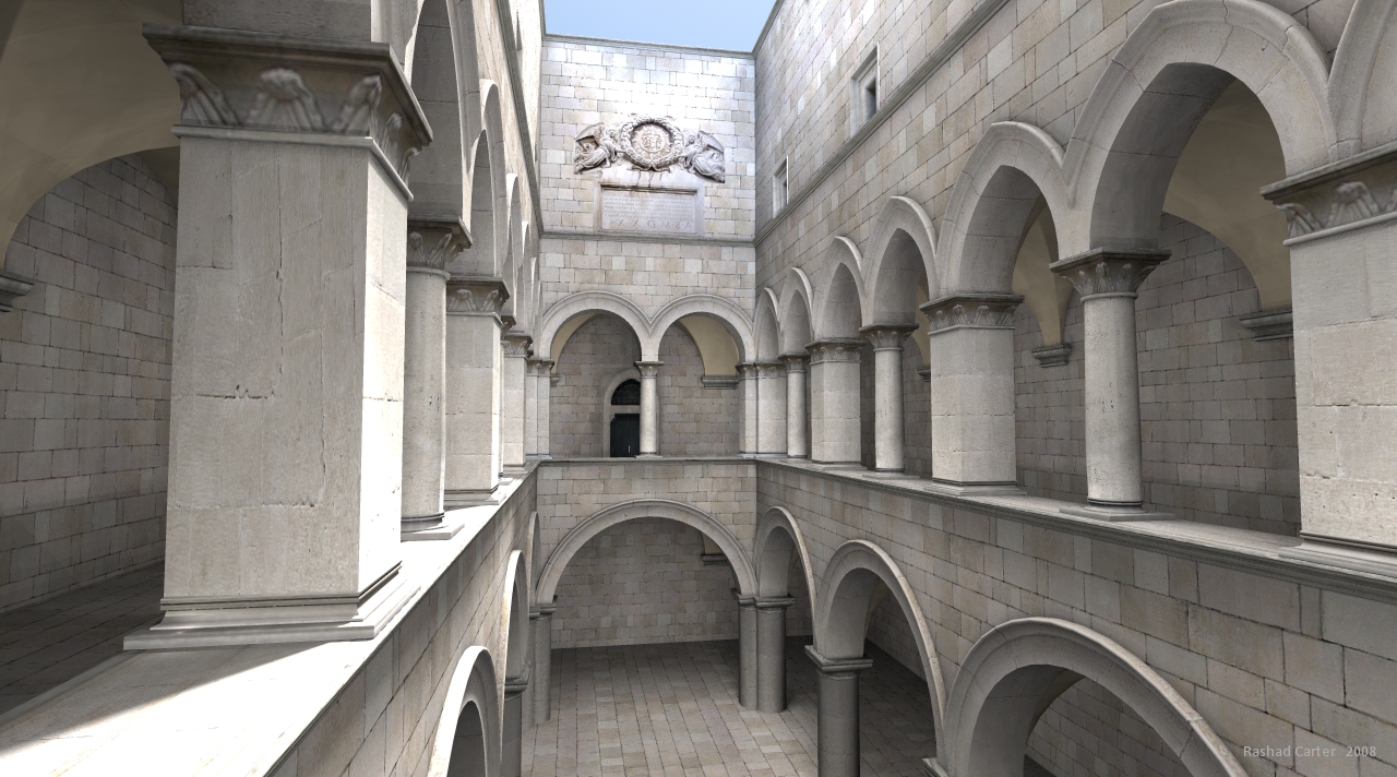
When I first set-up the lights I got an impression of brightness similar to this render. It felt very bright to me and with my bad mood at the time I felt the scene would have looked more realistic if the stone appeared dirtier and older and therefore less bright. But after uploading the original I checked online to see how others have lit this scene. In the GI renders from maz and lightwave and indigo I found that the scene was much brighter than the one I uploaded. So to prove that the darkness was a chopice and not a limitation of the lighting methods I rendered this. IT has levels that are more cheerful. As far as realism, I can see this bright versaion as realistic also. I reminds me of what Horo often states in regards to realism in a photo vs experience. A longer exposure will give a brighter image. A shorter exposure will offer a dimmer image. Which is best, you tell me. The lights are all exactly the same position wise the only difference is that I doubled the intensity of all lights proportionally. Feedback is appreciated. Also I like the idea of the monk and the torches and fountain. Indeed David I need to do something interesting to separate this render from the millions that have been done with this Sponza Atrium.
Comments (0)
Sign in to join the conversation.
No comments yet. Be the first to leave a thought.