FROM THE COMMUNITY COLLECTION
Havoc
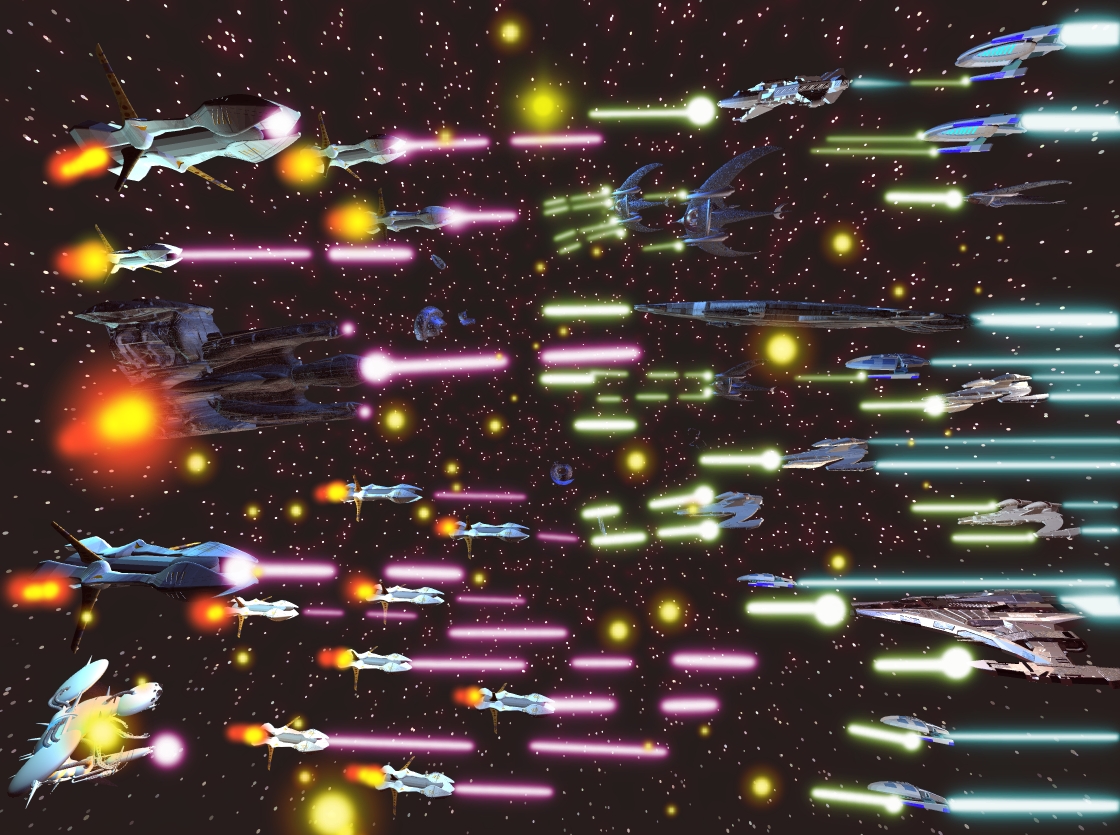
Space war ^^ hmm.. is it ok? or what... rendered in bryce edited in gimp
Loading unique views3,745 unverified legacy hits0.0 archived rating2008-08-07 added
FROM THE COMMUNITY COLLECTION
Space war ^^ hmm.. is it ok? or what... rendered in bryce edited in gimp
Comments 3
A conversation around the artworkSign in to join the conversation.
Thanks for your opinion guys looks like i over did the laser's lol
I like the "Alien Forces" best of the three images for a few reasons. The first one is the colors used - both in the textures/materials and the halo around the stars. Some ships have blue, the lasers have this pink-violet nuances and all this together works for you on the beneficial side. The lasers in the "Final Armada" look somehow overwhelming as a compositional choice, i.e. the blasts appear a bit too thick and plain. In the second image "Alien Forces" the lasers have this change in direction, there the viewer is starting to feel each one alien pilot's personality, the pilot's fanatic detemination to annihilate the enemy ships. Also the aliens appear to be a bit more chaotic in battle formation and does a good job in describing their inhuman nature and increasing the final feel and look to a noticably dramatic level. The "Havoc" I find less appealing because all we see is lasers.. everywhere... and the viewer is starting to visually lose the shape of the aircrafts. My main suggestion will be to thinner the laserbeams to a level when one's attention will be directed more on the ships that fight and not on the lasers themselves. This is one more reason why I find "Alien Forces" as best composed and executed production of the three. Good luck further in creation of those space battles, Archclan!
The single parts are all very nicel done. The way this scene is assembled makes it appear 2D. It is not easy to get a feel of depth in a space scene because we cannot use haze which would give us a depth clue due to some fading. Perhaps a different camera angle could help.