FROM THE COMMUNITY COLLECTION
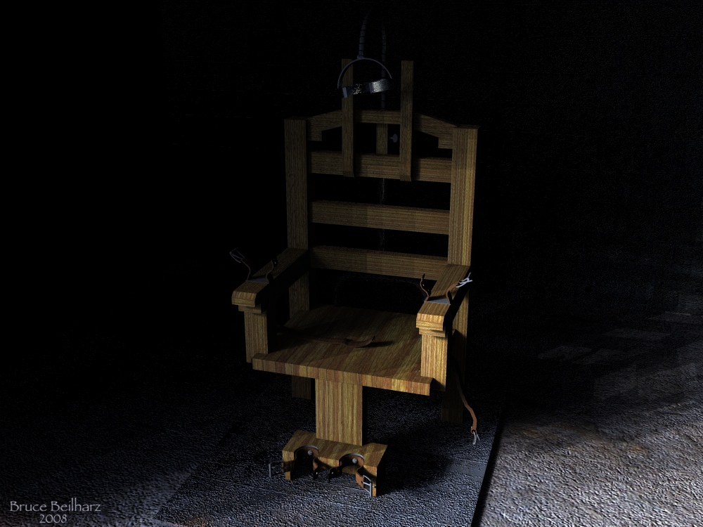
Angry Chair
Modeled and textured in Bryce 6.1. IBL lighting, shadow banding is an issue here. In order to get the look I was after, no additional light sources were used.
Loading unique views3,558 unverified legacy hits0.0 archived rating2008-08-11 added
Comments 4
A conversation around the artworkSign in to join the conversation.
AH! Old Sparky! ;-) Sometimes a simple image like this can have a powerful effect on the viewer. The way you lit this gives it a seriously spooky look. It also accentuates the bump map of the floor materials nicely. I think the grain in the wood of the chair is a bit tight but that's just MHO. Nice job!
Well, certainly not my choice of a relaxing chair. Being bare of any suggestion about this place submits it to the beholders imagination. Simple, yet excellent. Superb details on the chair, I must say. Lighting is most fitting for the subject matter. As of v.6.1, Bryce IBL has still those banding shadows issues - here most prominent on the back of the chair. If it were rounded, the banding would probably be less on an issue. Always keep in mind that "Quality" in Bryce IBL means "number of lights" and if the floor is not transparent, you get only half the light because the lower half of the light sphere is hidden below and you end up with a light dome. There are cases, when shadow banding is still obvious even with 4096 lights. IBL is great in giving you ambient light but sometimes it helps to add some very low intensity radials to break up the bands - or use high bump materials, which is not always advisable. I thinks, it would not help to cover the banding on the back completely.
Very good modeling of the chair. Nice detail work on the straps and latches and bolts. The floor textures are reflected well in this lighting. Great job.
Looks quite awesome, and scary. It is quite minimal yet detailed and the combination is frightening. What ever is it that goes on in this room? Yes banding is an issue, it could only be fixed by higher ibl quality, though I would say that the patterns of the materisl used can often help to hide the banding. The floor is a good example of this, the banding is much less obvious to me there than it is on the chair. Nivce work in this dark theme. Not everyone has the stomach to render such dark low light scenes in Bryce so it is really nice to see it from you. Great that you did not use haze here. or if you did it was very minimal. Too many indoor intimate scenarios are ruined by overhazing.