FROM THE COMMUNITY COLLECTION
Infinity Minus One
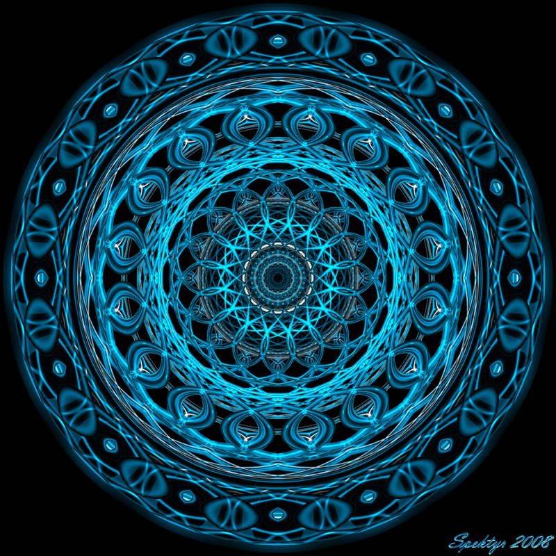
Here's my latest work. Glass toruses in Blue. I thought some of you might get a kick out of the name. If you don't remember just think of a computer named Eddie. ;-) All comments are welcome and appreciated.
Loading unique views4,999 unverified legacy hits5.0 archived rating2008-08-13 added
Comments 10
A conversation around the artworkSign in to join the conversation.
Yes, I agree, it does look like a fractal graphic image, and knowing that it is all 3d makes my brain acts somehow strange. When I look in the center and focus my mind there I can almost see the different parts (rings) rotating each in opposite direction. Quite nice trick... and maybe this has something to do with my CRT monitor, this eye illusion is a bit harder to perceive on LCD. Keep up!
Thanks, Gat!! It's a different configuration. I'm addicted to toruses lately. I'm trying all sorts of configurations to see what they produce. It's a ton of fun! :-)
. Good work spektyr. Is it the same setup as the last rig?
Thank you, Connor! I really appreciate this awesome compliment! :-) I have this one up on my desktop too. I usually put up my latest image on my desktop. I find it inspires me to do something new as often as possible. I have a new one 'cooking' right now and it's a really slow render. I can't wait to see the finished image. I know what it should look like but it's always great to see the full sized clean copy. ;-)
Again, wonderful. But it just occurred to me, (I have been looking at all of your pictures) and they are all so different and they are all amazing. I am very impressed with your ability to create new and amazing pictures so fast. I have this picture as my background on my computer. Looks great with a black all around it.
Thanks Guys!! Horo- A Doily! You're right! I hadn't thought of that. LOL The fine lines is done with very thin toruses. Render Man- Most of the whimsical names I use are simply made up. Orbus Iugum is Latin representing a 'Union of Rings'. Panton Iunctus is also Latin for 'Everything United'. Sometimes I look at an image and the name jumps out at me, like Convergence. This one also jumped out at me and gave me a laugh from the memory of Eddie's probability sum based on improbability data. ;-)
Just for the record my favorite is Orbis Iugum. I just can't resist I have to second Horo's comments on the embroidery. Nevertheless I have seen some nice embroidery work so this comment is on the positive side of things. I wonder were you get all these names for the abstracts?
Well, I remember Eddie quite well - even his backup personality - and that's about what I feel here. Something grandmotherly - embroidery. It does have charm though I get again that antiquities feeling like for the "door knob". This could be atop the chest of drawers with the "knob". Excellent job of doing such with so fine lines.
Thanks Connor! I have a hard time choosing my favorite out of these too. This one has a fractal quality I like but the pattern of Orbis Iugum is very attractive to me. Convergence gets kind of frantic at the center but I like the transparent look of the filaments. They remind me of plastic more than glass. I have another one named Panton Iunctus that looks a lot live this one but ir's in a gold tone. I have that one posted on my web site.
So, I have spent the last five minutes trying to figure out which one of the three new pictures is my favorite and I have narrowed it down to one of the blue ones. The center Orbis Iugum is very well done, I really like that pattern you used. One Infinity Minus One everything is perfect. I can not find anything that I do not like about it. I also like the green one, but the shade of bleu that you used for these pictures wins. They are all amazing.