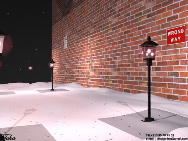
Hey, nice texture on that brick wall! Agreed fully with Horo that this iamge would greatly benefit from soft shadows. I like the bright spots within the lamsp, they look very realistic. I like the accumulation of snow along the bottom of the wall, makes the snow look just as it should. The end of the world never looked so inviting yet offputting at the same time.
HO
HoroArchived
Nice. You could improve this by rendering with soft shadows. Since there is yet another lamppost beyond the wall, the snow ought to be visible, too.
Comments 2
A conversation around the artworkSign in to join the conversation.
Hey, nice texture on that brick wall! Agreed fully with Horo that this iamge would greatly benefit from soft shadows. I like the bright spots within the lamsp, they look very realistic. I like the accumulation of snow along the bottom of the wall, makes the snow look just as it should. The end of the world never looked so inviting yet offputting at the same time.
Nice. You could improve this by rendering with soft shadows. Since there is yet another lamppost beyond the wall, the snow ought to be visible, too.