FROM THE COMMUNITY COLLECTION
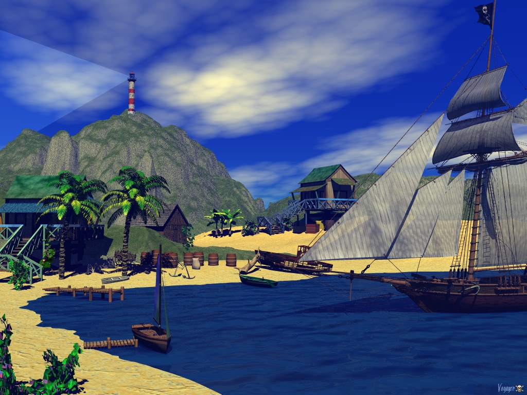
Capt's Island
After uploading the wrong thumbnail for this the first time, I got it right this time thanks to Rashadcarter. I attempted to make a "Day" scene and a "night" scene for this wall.
Loading unique views3,322 unverified legacy hits0.0 archived rating2009-04-06 added
Comments 4
A conversation around the artworkSign in to join the conversation.
I had the water looking great, but somewhere down the line while working on other items, the water lost a lot. I agree, it looks too solid and needs transparency. It's hard to explain why my scenes look like illustrations in some book, I'm not really going for realism, more fictional I would say. Also, the college I went to a hundred and some years ago, to me, ruined my artistic talent a bit. They taught more on the precision side of art. All the Professional jobs I had with various printing companies, we had to measure in thousands of an inch, no 1/8, or 1/16, we never even used those terms. This was due to the silk screening and lithograph printing standards. Some of the stuff I designed for cars was never even heard of til about 20 years later. The GPS unit in a car is an example. That never came out in an actual auto until about 15 - 20 years after I had designed a dashboard with it in it for GM. Whew, got carried away there, sorry guys.
Great compositioning, but I think the lighthouse is a bit excess here if it is the scene about pirates (do not think I'm very carping, because I like this scene very much even as it is:). You could add sea gulls to add some dinamic to this scene.
The composition is very nice. I would also have a couple of tech advice if the intent of this picture were to look realistic. However, I rather look at it as an illustration for a book about pirats for youngsters. These saturated colours have a charm of their own.
Nice! The light from the lighthouse is sharp edged, there are alot of ways to fix that and it will not increase render time at all. The water seems a bit solid. One of the most important aspects of water is the transparency. Make sure the water is not overly burdened with dark colored volume and transparent channels, keep the water cleaner at this shallowness close to the beach. Cleaner water much less blue, more clear. The sky looks great, but to me it is too much blue/purple instead of blue/green as the real sky. Also, lower the saturation of the sky color a tad so that the sky will blend better with the clouds. The composition of the image is spot on, which is why I offered so many technical suggestions. Very great potential here and you should be proud of what you have accomplished here so far.