FROM THE COMMUNITY COLLECTION
Who's In The John, John?
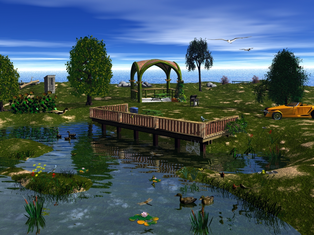
Another 9 hour project. Lot's of little things in here that almost drove me to drinking. I tried a lot of different sky & water mats, but after working on this all day, I gave up. Should have added a little motion for the ducks and the cattails' tops came out almost red. I've been noticing that the colors in the scene while I am working on it get a little brighter when I do the final rendering. But, all in all, it was fun doing and if you can't have fun, what the heck. Oh, the original name was "Picnic Time", but I noticed that when I started this, the door to the outhouse was open and when I was at the end, it is now closed, so out came, "Who's in the John, John? Lol. Hope you all enjoy.
Loading unique views3,862 unverified legacy hits0.0 archived rating2009-04-14 added
Comments 4
A conversation around the artworkSign in to join the conversation.
Really good....There is alot of things to look at I like that.
I really like what I am seeing here! The placement of the objects is itself amazing. Everything looks great. The spider's web is a very nice detail. Horo covered most everything I would mention. I think at this stage you are getting fully familiar with the tools. At some point we could begin to talk further about lighting but as is you have done extremely well. A brighter sunlight could be useful, instead of the default sun you could use a radial. The sunlight as is now is nice and has a good evening feel to it, but if you drive the intensity just a tad further, the image will pop nicely. With vegetation, try to use the less saturated greens, it makes a huge difference. Also with the sky, I try to avoid a blue tht is too far into the purple range, a greenish blue usually works best, and again, do not use full saturation, less is more with the sky and vegetation. Scaling is an issue always that we must address. Seems the scaling of the buildings in general and the car are all very small compared to the animals, your intended focus. There seems to be an exaggeration in that aspect, which works brilliantly artistically, but less so practically. Very effective piece of work overall Rebel and I am very much encouraged by what I see here. Look forward to seeing alot more from you.
Oh there was a lot of work to put this one together, that's for sure. The spider's web is a bit large but a nice detail. Try to tweak the materials you get out of the library, like the one for the terrain. The water is beautiful, transparent at close proximity and reflecting in the distance, according to the viewing angle. Since water is transparent, the floor is important for the appearance of the water as well. Your water looks so good because you made a good decision for the floor. The ground could be a triffle lower, making the pond a bit deeper. Perhaps I don't see it correctly and it is deeper than I think it is. The shadow I see from the duck at right in the foreground ought to fall on the ground, not the water surface. It is very difficult to see which one it is. The number of birds and butterflies is amazing, there are at least two dragonflies. The stone heaps in the background look really good, too. Are you sure the car's size is correct? It appears a bit small to me. A very elaborate scene. Rashad may also point out a few things I haven't covered that would help to yet improve.
Very nice picture. I can imagine that it would take forever placing everything here. The water closest to us looks really great.