FROM THE COMMUNITY COLLECTION
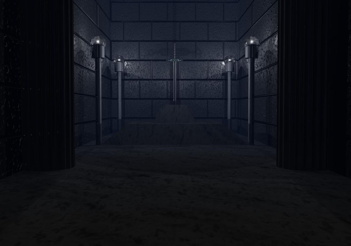
Cliche 1 v.2
I've altered the lighting, and camera positions, added a couple of columns, and altered the material on the pedestal and floor and added a radial light to better illuminate the sword comments are welcome
Loading unique views4,094 unverified legacy hits0.0 archived rating2009-04-23 added
Comments 2
A conversation around the artworkSign in to join the conversation.
Looking better. Kill all haze, it is a mistake easy to make since Bryce automatically places us at worl center with lots of haze. Remember to remove haze for indoor scenes. I think you took the suggestions from last time very well.
The composition looks better this way. This is an interesting shadow on the wall from the sword. I still think having the main object - the sword - brighter illuminated would be good.