FROM THE COMMUNITY COLLECTION
Livingroom3
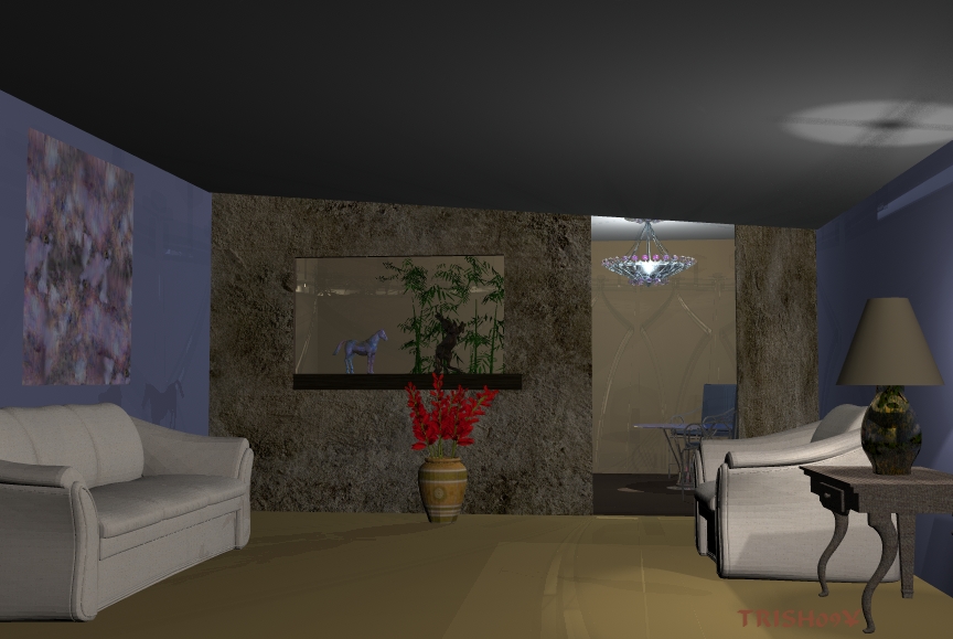
I didn't put too much into this I wanted to see if I did the shadows right.
Loading unique views3,045 unverified legacy hits0.0 archived rating2009-06-24 added
FROM THE COMMUNITY COLLECTION
I didn't put too much into this I wanted to see if I did the shadows right.
Comments 6
A conversation around the artworkSign in to join the conversation.
Getting better! There does seem to be a bit more going on with the lighting, I see some shadows. The sofa leaves me with a few questions, such as where are the lights exactly and which ones are casting shadows and which one's are not? More in the other pics.
The lamp came from 3d archive Thanks again
Again good indoor render! Where did You get this great ceiling lamp? It looks amasing! I would like to see your further progress!
Thankyou for your imput I will continue to work on the things suggested.
I've only attempted a few indoor scenes and none of them was a real success. Nevertheless, I have a bit of additional advice. Put in one or two radials to be able to properly place your furniture, etc. Then decide wher you want the light sources and if there is a window where the sun can shine in. Then remove the first radial(s) and position the lights. Adjust intensity until you feel it is comfortably lit. Then start looking for the shadows. If they are too dark, put in additional, week radials (square falloff is sometimes good, even ranged fallof) and switch the shadow casting off for those (to prevent false shadows and it renders faster). Finally, check if soft shadows helpto make the room(s) appear more natural (usually, it does). There are a couple of things wrong here. As richter already pointed out, the shadow intensities at different places are inconsistent (seats left and right versus from the plant). The lamp gives a nice pattern on the ceiling, but the lamp itself is dark, which is not natural. The lamp in the anteroom, however, looks very good and it seems to be responsible for the shadow from the plant. I don't want to overload you. There is one serious issue you ought to address: the dark "shelf" below the picture at the far wall next to the door appears very flat, like a wrong shadow, it is not obvious, what it should be.
Are there more lights apart from those we see in the lampshade and the chandelier in the back? There are shadows visble, but if you're using secondary radial lights to fill the room's dark areas, you should lower their intensity quite a bit so your shadows don't appear washed up. An indicator for that (I always find helpful) is to look at the bottom of your objects - chair or the sofa for ex. They cast shadows on themselves and have very dark regions underneath - darker then the main ones they cast on the floor, or the vase's shadow with the red flowers. That's the indicator. So you should balance the both type of shadows untill they're equally dark. In the end (1) lower the secondary radials intensity or (2) for now let your only light sources in scene to be the ones we see. You'll get much darker result (more of a night type scene), but at least the lighting will feel natural. One more thing - make the lampshade's surface a bit transparent, not so opaque, so it can be taken as light source. Things are improving..