FROM THE COMMUNITY COLLECTION
Good Old Days are Gone
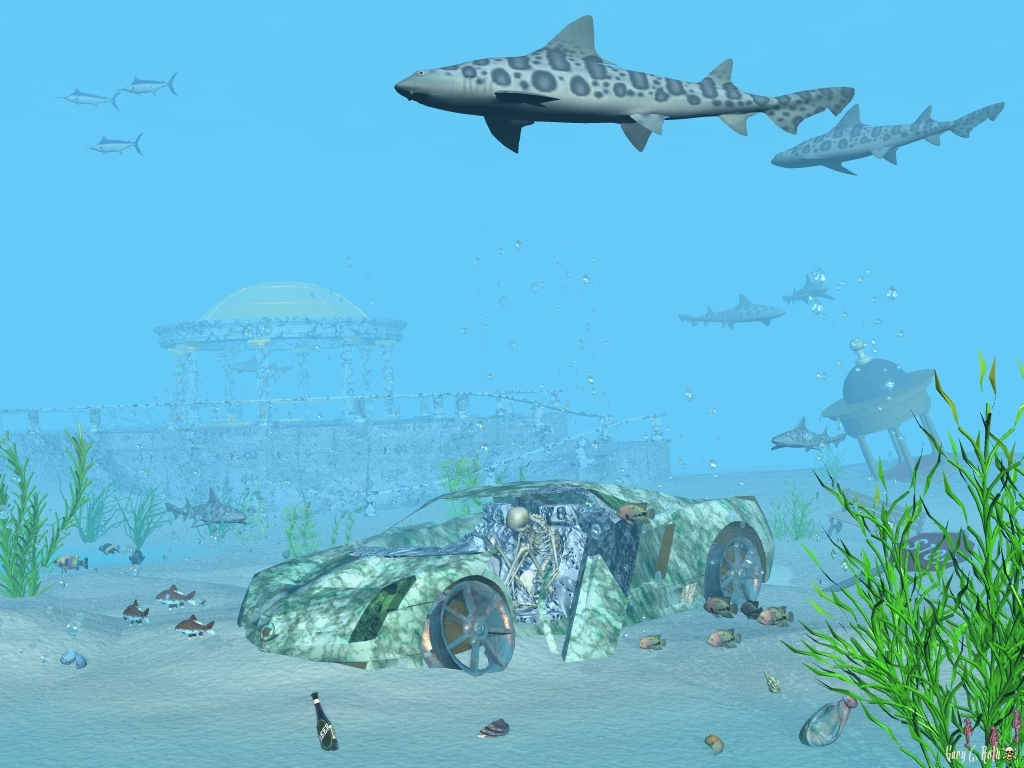
I thought it was time for another underwater scene. I did use "Regular AA". This scene is to mark the government's "Cash for Klunkers" program, lol.
Loading unique views3,766 unverified legacy hits0.0 archived rating2009-08-12 added
Comments 4
A conversation around the artworkSign in to join the conversation.
Is that a perfectly good bottle of alcohol in that sand? Nice Rebel! For me, the scene has all the visual elements it needs. I would myself prefer a little deeper look to the water, less brightness. On the issue of shadows, you please understand that shadows are not problems, they are solutions. Light tells the story of a scene. To try to tell the full story of a scene with light requires both light and shadows, because our existence is temporal, cause and effect, light strikes a surface and a shadow results. Trying to tell the story of a scene using only light without shadows is like only telling only half the truth when on the witness stand. The impact will not be as strong as you intend. So instead of running away from shadows, I hope you will explore ways to manipulate shadows to play down the less important elements of a scene, and use the light concentrations to emphasize the more important elements. Think of it this way, at this point all of the ideas here seem to be of equal importance in tems of lighting.I do not know where this story begins or ends. This leads to confusion for the viewer. What exactly is the point of this piece, is it the beautiful markings on the fish or is it the dead guy or what? The lighting should answer these questions automatically, I should know which ideas are the most important. If you had used light and shadow as storytelling tools, you could have answered all of those questions with complete confidence. Does that make any sense?
Generally very nice fish and the water is feeling like water. Shadows are indeed the main problem. Except the fish above, everything looks flat. The bottles also should cast a shadow on the sand, which looks quite good.
Yup, I do seem to have a problem with shadows. I di experiment using various degrees of shadows, but, could not find a decent degree of shadows.
Yes, the use of Regular AA is evident, which is nice. The bubbles present are needed addition and bring the sense of dynamic in the image. Haze settings seem fine, I really feel underwater. The issue, in my opinion is the shadows... again. See how dark is the belly of the (Tiger?)Shark in the top part of the image and compare this to the almost invisible shadows of the seaweed on the low right. This is not natural, not realistic. The difference between the two shaded areas is that the first one (shark's) is self-shaded (in Bryce Material Editor - "Self Shadows"), the second is directly casting its shadow on the sea bed (in Bryce Material Editor - "Cast Shadows"). Although different this way, they ought to be with the same darkness saturation. Since I know you avoid using ambience (I hope), the solution might be the Sun/Moon shadows percentage - keep it always above 75% to ensure equal shadow saturation. Without this the clams, shells and bottles, even that Cien (Cadillac) look like pasted on top of the rendered image without enough 3d depth. See what you can do about it.