FROM THE COMMUNITY COLLECTION
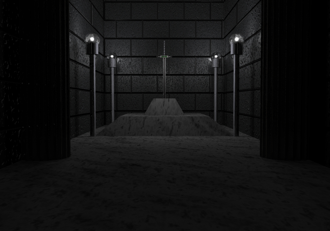
Cliche 1 v.3
This time I turned on soft shadows. Increased the lighting on the sword. Removed the tint color on the main radial. Removed all haze and fog, and turned on TIR. I think this will be the final rendition before I begin work on cliche 2. Unless of course there is a problem that I missed.
Loading unique views4,381 unverified legacy hits0.0 archived rating2009-08-12 added
Comments 3
A conversation around the artworkSign in to join the conversation.
Very nice. Richter as usual has properly diagnosed the primary issue to work on next.
Much improved. However, Richter's right at giving the sword mor emphasis. You could add a shiny aura around it (elongated sphere with some volume fog or such). One thing disturbs me: The floor melts into the first step of the pyramid and this looks optically wrong - almost "Escheresque". We would expect to see a sharp line between the floor and the first step.
Technically you didn't miss anything and should procede with "Cliche 2". Aeshetically - I see the sword is the center of the image and thus being the focus (as the only unique obj in scene). So you have to emphasize it somehow - physically rescaling, enlarging it, or at least apply some glow or kind of aura around it. After all, the question that needs answer is "which is more important - the lights around the sword or the sword itself". You need visual gradation to the main important object. You began with placing it on a pyramid-like pedestal, it gets thinner towards the top. Here's one half of the emphasizing. Now just let the lights be smaller or, as I mentioned, make the sword pop-up more to aesthetically complete the second emph. half.