FROM THE COMMUNITY COLLECTION
The Path
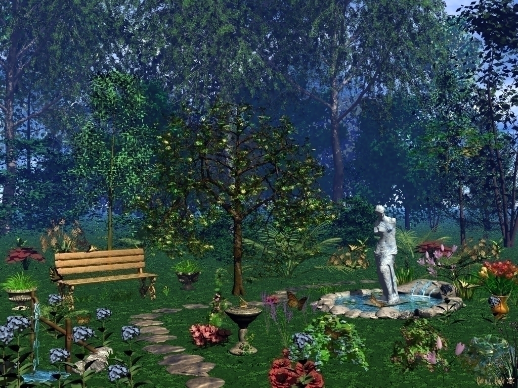
Just something I cooked up. Used Regular AA. I used many different plants, of which one I wish I wouldn't Have-the purple ones in the left hand corner. Who ever heard of a flower with a flat back?
Loading unique views3,583 unverified legacy hits4.0 archived rating2009-08-12 added
Comments 4
A conversation around the artworkSign in to join the conversation.
. Oh I really like this one - can almost imagine fairies dancing around! By the way I can see that path quite clearly to just behind the fountain.. Always wonder how much difference ones monitor makes, maybe mine shows the path up better than Richters for some reason? Also I think the water flowing into the fountain looks great - now I'd be interested to know how you achieved that effect?
Well - I like it. It has a Rebel-look to it. I perceive it as a mix of real and fairy. Perhaps the bench is a bit on the large side. I like how the water ours into the basin. As for the background trees Richter mentions: you can't cheat on him, he's found out everytime when I used the same tree, even if I rotated them. You could fool me here, I've only found out because I was pointed to it.
You are correct Richter. I don't know how I missed not rotating that darn tree, oh well. On this wall, I had to keep reducing the DPI in order to get it from the original 1MB jpg to this 749kb wall. The colors have been "dulled" by doing this. There is a revised wall coming plus a wall of the same scene at night.
I heard of them :), they help reducing the Ram consumption of Bryce. I almost barely see the path. Maybe that's the idea. Leaving that aside we have too many completely different objects with no purpose in relation to the overall composition and disturbing lack of shadows on the ground. The only thing I find to my liking are the background trees, though if I look closely I can see that the same tree has been duplicated but sadly not rotated not resemble the randomness of a forest. So overall - rich detail, lots of objects, each really nice individually, though not working together in the sense of colors, size and above all - as purpose. It my sound harsh, but you need to know where your image needs "reparing" in order for you to improve.