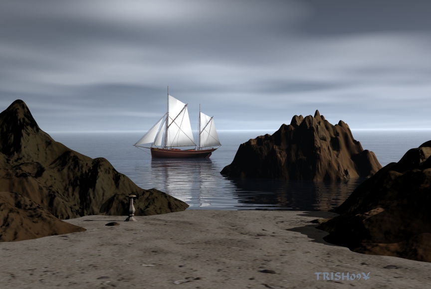
It would be better to have less contrast between the rocks' color and the sand color. Now they seem too different to belong to one and same beach. Speaking of which - you have really nice waves near the sand, but the wave-pattern in my opinion looks more of a lake-type, then a sea. Not a critique, just simple mention.
JO
JoAJArchived
.
My only comment is that if this were real, the yacht would be a bit too close to the rocks - unless you knew that you had plenty of water under the keel - hope there's not an onshore wind here! LOL.
HO
HoroArchived
With such a sky, lighting the scene becomes simpler because without any direct light, ther are no shadows cast. However, the parts on the back side of the diffuse light must also be brighter. The rocks are too dark on those sides. You might have to reduce shadow intensity or add a few weak radials.
Comments 3
A conversation around the artworkSign in to join the conversation.
It would be better to have less contrast between the rocks' color and the sand color. Now they seem too different to belong to one and same beach. Speaking of which - you have really nice waves near the sand, but the wave-pattern in my opinion looks more of a lake-type, then a sea. Not a critique, just simple mention.
. My only comment is that if this were real, the yacht would be a bit too close to the rocks - unless you knew that you had plenty of water under the keel - hope there's not an onshore wind here! LOL.
With such a sky, lighting the scene becomes simpler because without any direct light, ther are no shadows cast. However, the parts on the back side of the diffuse light must also be brighter. The rocks are too dark on those sides. You might have to reduce shadow intensity or add a few weak radials.