FROM THE COMMUNITY COLLECTION
Departure
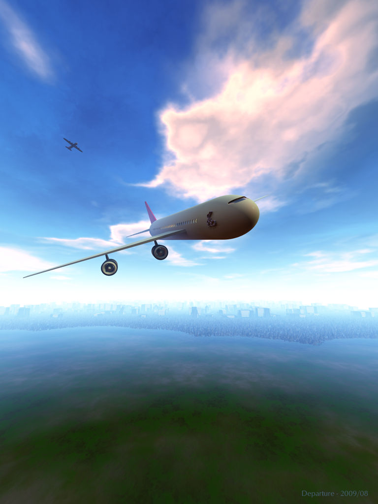
The city in the distance is made by two terrains, the rest is the ground plane. The aero planes I most probably got from the Internet ages ago. Sky and clouds are from an HDRI I made from Ernie's Bryce artwork (available for free for DAZ forum regulars). The HDRI gives the ambient light and a subdued sun gives the light some direction.
Loading unique views4,131 unverified legacy hits0.0 archived rating2009-08-19 added
Comments 5
A conversation around the artworkSign in to join the conversation.
. Really love the city!! Also the HDRI you made from Ernie's clouds. Was this a long render?
Yup - the placement of the sig is a bit unfortunate from an aerodynamic point of view. The plane is a bit retro, I agree and also a bit low res, too. The city is a quickie, a high res terrain with spikes and another one with city blocks. There ought to be a few higher buildings to make it more convincing, I do agree. The warm light from underneath is from the HDRI. The light probe used was the same as for Arrival (Space), just turned upside down. The colour looks nice on the plane but it is not realistic. I think this is a nice render if you don't look to close ... Thank you all for taking an interest and comment.
Very goo donce again. This reminds me of a few simulations I have seen. I really like the lighting, and you seem to have a nice warm glowing light from underneath, almost too orange to appear to be the result of the green world beneath, but still very good. The sky looks great. I wonder, if perhaps even the normal yucky flat Bryce skies could be made to look highly realistic if Bryce could output images and render skies in hdri format?
I'll have to agree with Spektyr about the logo. While it seems original where it's been placed, the pilot of the plane will surely have a hard time navigating in the right direction. Really nice clouds I must say! The city.. well, it's a bit uniform in height to me and I'm not too fond of the strong "cut" where the city ends. At least a few more small buildings dispersed widely at the edge to help blend the cityscape into the land. But if the green (maybe because of the material pattern) is supposed to be some sort of polluted sea/ocean, then there's nothing wrong with the buildings "boundary".
Nice! The haze, clouds and city look great! The plane design looks a bit retro and I think the engine struts should be a lot thicker. They look too weak. That raised logo in the side looks like it would add a lot of drag too. ;-)