FROM THE COMMUNITY COLLECTION
5 Butterflies
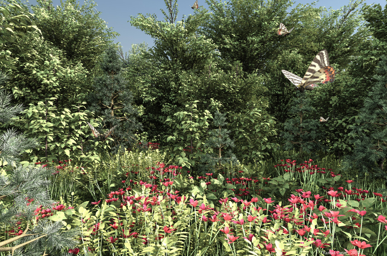
Lit with my usual outdoor lighting rig. This image is mostly an experiemnt with getting a more natural look from the complex and natural appearance of the Carrara trees. Feedback is most appreciated. Thanks all for your time.
Loading unique views6,752 unverified legacy hits4.7 archived rating2009-08-20 added
Comments 5
A conversation around the artworkSign in to join the conversation.
Amazing nature "photograph"! I lack of words. Well deserved top vote! Strangely enough both Horo and Spektyr are right. Now how's that?! :) The image is almost a monochrome shot if we don't count the flowers (and wings of the butterflies). There's this HSV acronym which stands for Hue, Saturation and Value. Here the hue and saturation are "pinned to the wall" while only the Value (color brightness) has variation around the image. That's why it has this monochromatic look. And here I disagree that monochrome equals realism (it helps it sometimes, but it doesn't create realism). That's why Spektyr's right, colors in Nature do possess "lifelike" saturation, which makes us say "Oh!" and "Ah!" when looking at a beautiful forest or a mountain range. That being said, nothing in mother Nature is too much, everything is balanced, colors included (if something isn't right, then it's because of human intervention). And Horo very well knows that, that's why he's right too. I think that when adjusting the proper brightness, contrast and saturation for this image (maybe 5-to-15 for the sake of experiment for each value), Rashad, you should look mainly to the small part of the visible sky, until as Horo said - it gets more to the clean "pure" light blue, not greyish-blue. The rest of the image colors will adjust quite adequate.
. Always love your vegetation images Rashad. Are all the trees Carrara ones? Also was wondering what sort of flowers you have in the front.
No, spektyr is wrong. The saturation on the vegetation looks very real. More saturation might be more pleasing but it wouldn't be real. Great job, indeed, Rashad. Beautifully rich vegetation. With all those plants, Bryce came certainly to the dreaded memory limit. The lighting is perfect, too. My only qualms are with the sky. Though it is true that the sky is usually not determined by the amount of blue but rather by the amount of lack of green, your sky (not the sky light) is a bit much on the grey side. It might look that way near a large city, but in the country, it is bluer. As it is, it looks rather like the preamble of a storm comming up. Perhaps a cloud or two could break up this impression.
Everything looks awesome. My only suggestion is to push up the saturation on the colors a bit, add green to the leaves, blue to the sky and make the flowers brighter. It would add 'life' to the whole image. ;-)
great job Rashad.Love those pine trees