FROM THE COMMUNITY COLLECTION
The Green Room
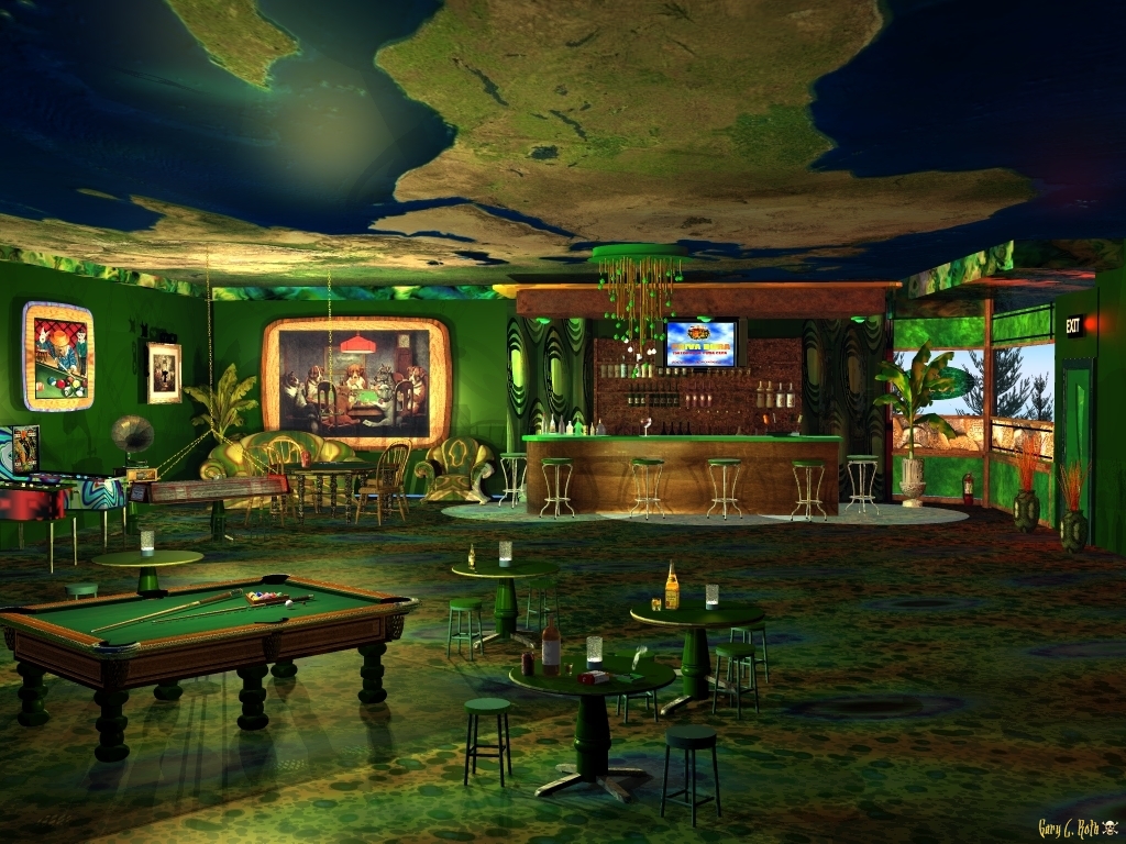
This is my first attempt at rendering a room (bar) interior and probably the last. I spent an insane amount of hours on this wall. I changed colors, mats, textures so many times I lost count, who wouldn't after 5 days, lol. I really got addicted to working on this every day to see what more I could come up with. At 10:50 tonight, I stopped, this is it, I give up. No more interior scenes. Used regular AA
Loading unique views4,055 unverified legacy hits0.0 archived rating2009-08-28 added
Comments 8
A conversation around the artworkSign in to join the conversation.
. What a great idea for a ceiling. I love the whole concept, there's so much to look at and I love the colour scheme as well.
Hi Horo and thanks for the comments. It seems everybody wants me to do more interior scenes, well, I've started another one for ya all,lol. Now, the light pools. The pools of light you are seeing are from the top of the bar. They are the globe type you might see in different stores, restaurants, bars and in schools. They are on the very edge of the top of the bar. The shadows you see are from an "oops", lol. There is a table(you can see the base if you look just past the pool table light) by the gramaphone that has one of those table lights like the rest of the tables. When I lowered the intensity of the table lamps, I missed that one. Hope that explains it.
The ceiling is the first thing I noticed and I must say, this turned out to be an excellent idea. Chosing Africa being at the centre enhances the idea of a green room. The furniture is placed very well. I like this composition very much. A lot of minor flaws were reported by me predecedessors. The light pools at the bar looks a bit as if there was a floating second floor and we miss the shadows from the stools on them. But there are shadows on the wall of the bar. Do not despair with indoors. They do take a lot of time but the results are usually worthwhile. You did an excellent job here. The composition is just great. You seem to have a talent for indoors as well. Keep it up man!
Thank you Rashad. Maybe I will do more interiors even though I go absolutely bonkers trying different textures and colors, lol.
Honestly Rebel, this scene is amazing! Love the details, and eve the scaling seems to work. Love the colors, that ceiling is very impressive. This render is much better than you perhaps realize!!!! I think interiors suit you just fine!!
Thanks Richter. The wall you are referring to is an angled wall. The woodwork separating the 4 glass panels is as thick as all the walls. I had a heck of a time with that section, placement of glass, etc. On the right glass panel is a green oval, but the inside tree in a pot kinda hides it. Darn those cue sticks. I kept raising and lowering them and still did not get them right, these old eyes just aren't what they used to be. At one point in this design, the ceiling did have the look of being curved, but I lost that somehow. I tried to get it back but failed. I messed with the Texture Mapping but still could not get it back. I think it was because I used a different Earth .mat file. It's hard to see, but the hanging light above the card table is one of those old western type chandeliers. It has candles inside of light bulbs, but I do not know why they are so bright. I have the Light Intensity set at 2 and the Cast Shadows at 100. I think that is where things went wrong. I should not have had them cast shadows. Could that be it? This was actually fun to make and I might try another, but my brain needs a breather, lol.
Very good color palette choices. I really like this work of yours! Many objects you have, not too much, nor too few, each one carefully placed. Exception are the billiard cues, the shadows of which give away they're floating... a bit. If the trees and the sky seen on the far right are the actual exterior and not texture (or some kind of angled screen) you should've made your wall thicker. Now it's more like a simple wood panel that separates the "out" from the "in". Really nice idea to put an Earth texture for the ceiling. I can't keep wondering what if you really had a curved ceiling. It could've been an interesting architectural element and add to the personality of that image. The whole place is convincingly lit, the only problem is that the light sources (current models) don't give the impression of so intensive light capability. More lamp models could justify the amount of light in this interior. Finally - do not give up the interiors creation just because a project could take longer. That's the way it is, the nicest results require enough time spent on the project, just as you did. Now just take a deserved brake until you have another inspiration.
Forgot to mention that using the .mat file of the Earth for the ceiling was really crazy.