FROM THE COMMUNITY COLLECTION
Rapid Evac
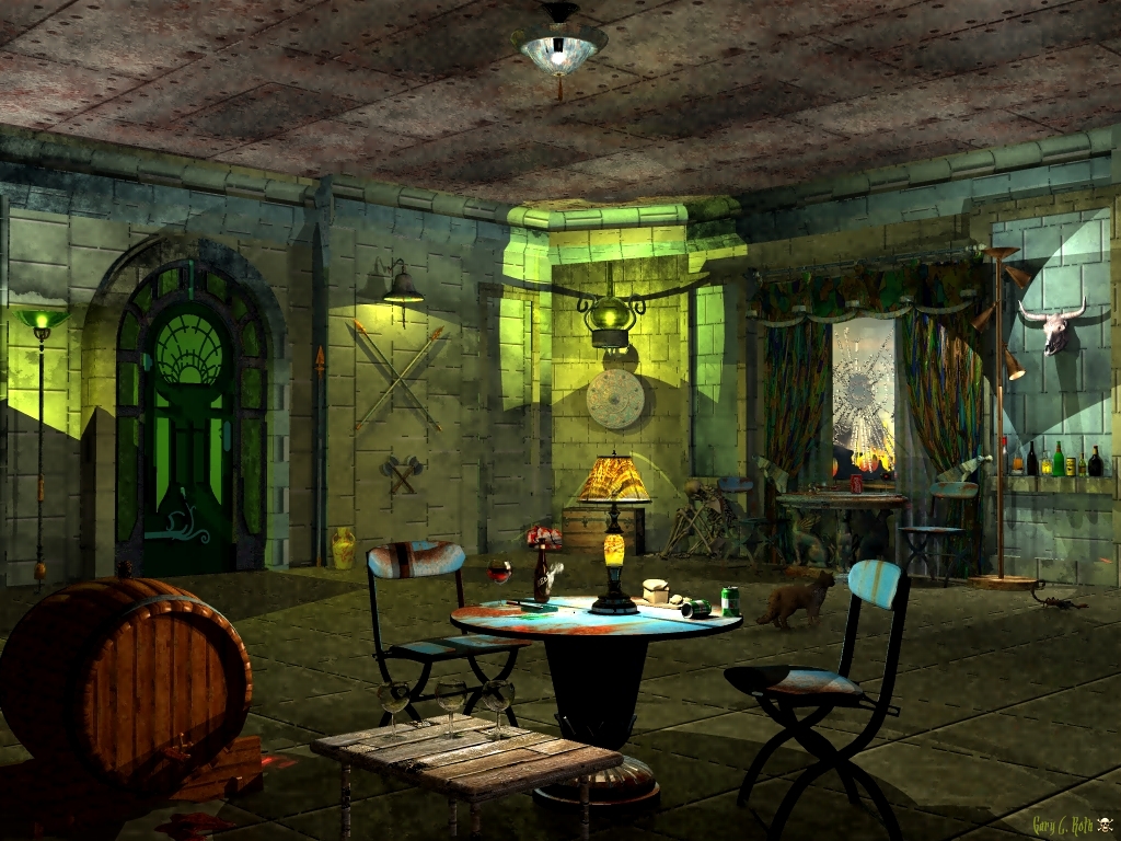
I was going to call this "The Corner" until I added the wine glasses and lit cigarette. As a few of my other renderings, I worked for 4 days on this and finally said, enough is enough. This is half Modern and half Medieval, or something like that. As you might perceive, this is during a war period, possibly in the future. The only lighting I used is Radial lights. What can I say about the textures, lol.
Loading unique views4,419 unverified legacy hits4.0 archived rating2009-09-23 added
Comments 10
A conversation around the artworkSign in to join the conversation.
. Oh great, another of your indoor scenes - which I love! As for the scorpion - yikes I wouldn't want to get too close to that!!
D'you mean the skeleton? Nice pose.
Bravo Horo, but there's still another object in the scene that blends in.
Ah the cat is staring at the scorpion.
Mmm, nobody has mentioned anything about what the cat is staring at, or another item, lol.
The name and the scenery remind me of the Mary Celeste. Skillfully done!
Very smart image. What i really like is the lighting overall. I agree, this needs soft shadows. But even without the aft shadows I can tell that you are using the light and the shadows to tell your story...Excellent! I think you have an incredible talent for this stuff, I tip my hat to you. Very inspiring work!
Wow this is really cool!! It reminds me something about the Myst game...Very neat door. I just like the whole feel.
Thanks Horo. I think I just got burned out on this one. It isn't really the way I wanted it to turn out. I used "Regular" AA and it took 3 hours to render. Enough of this type of interiors, lol.
A bit on the green side but a really nice indoor. I like the cat. Suggestion: try to use soft shadows. For the lights with shades, like the lamp at right and the one above the spears, try to use spots with soft edges. But not at max, perhaps 20 to 30%. I don't know whether you wanted it this way but some of the gaps between the stones in the wall with the spears are missing; same thing on the wall to the right of it. You might have to render this with premium anti-aliasing with 16 or more rays per pixel to make them seen. If it were not for that and the hard shadows, it would be a 5/5 for me. Nevertheless, excellent work!