FROM THE COMMUNITY COLLECTION
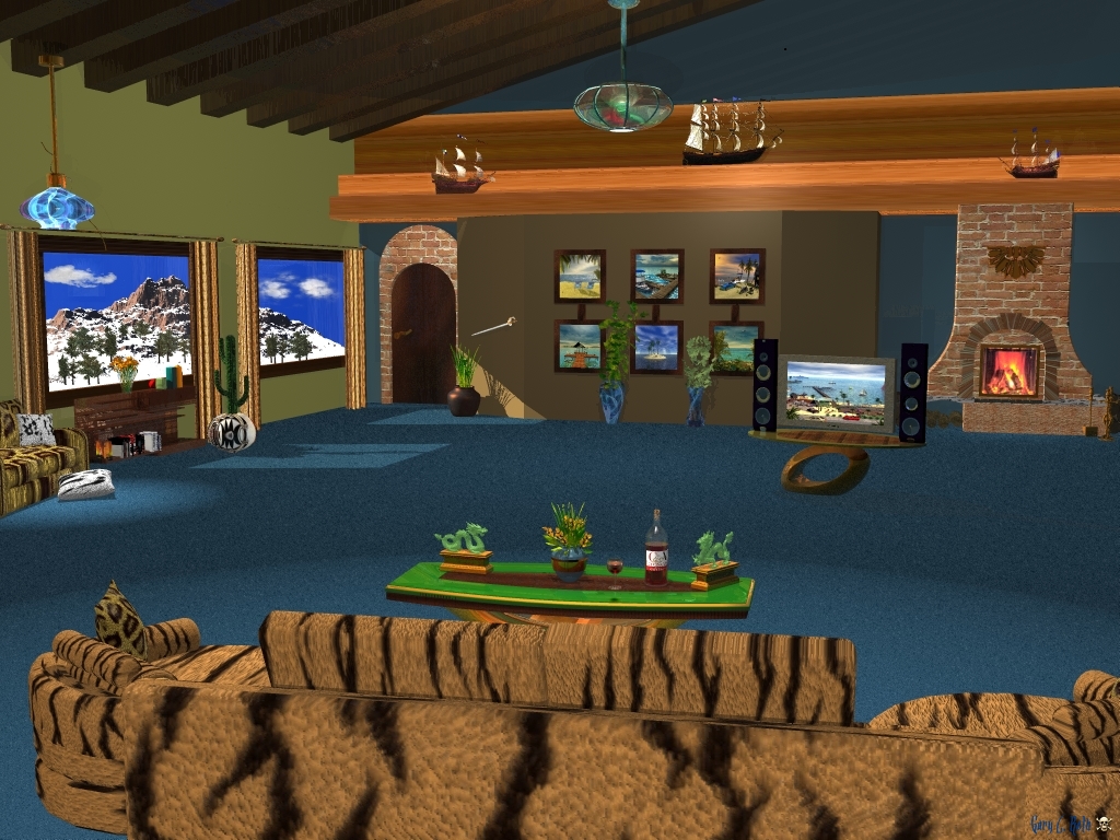
Mountain Retreat
First of all, I'm ashamed to even mention how much time I spent on this render. As you might notice, some of the shadows did not come out the way I wanted them to, tried a lot of different aspects, but this was the best. I used "Regular" AA. This was fun to work on, but towards the end, it was pretty difficult to abandon the idea I had to throw my computer out my second story window, lol.
Loading unique views4,703 unverified legacy hits0.0 archived rating2009-10-16 added
Comments 5
A conversation around the artworkSign in to join the conversation.
. The details in your work always amaze me. I've probably said it before but there's so much to look at - particularly in your previous indoor render, I feel as though I see something new every time I look at it.
Hey Richter, thanks for the comments and info. I downloaded the examples you provided and will study further. As for running my graphics thru a PShop filter, I do not have PShop. I am and have been, all my life, an Artist. I have painted hundreds of paintings and have sold every one of them except for 4 I have hanging on my walls, and those I will never part with. I like colors and textures. I am my own Artist and my renders are not perfect, but they are my renders, and I like most of them. p.s. A lot of people from other web sites love my scenes.
I like the style of the piece, well, except for the tiger print. It is hard to look directly at anything with a tiger print, even a tiger! Just kidding with you, poking some fun. Shadows are an issue here, but it is not the biggest concern. The outside looks almost like a painting. I like the manner in which the light shines in from outside onto the floor. Fun. Wait a minute, do I see a leopard printed pillow on a tiger printed sofa? You do realize that such disticnt prints within close proximity does indeed clash at all levels of fashion sensitivity! It was a brave choice to say the least. The cacti in the window with a snowy mountain scene outside is a nice and unexpected contrast.
Again a very nice indoor. Using your previous artwork as pictures and on the TV is a good idea. The outside is a Bryce terrain, it seems, and it looks good. However, it looks a bit on the artificial side. I think there is some haze missing. You could also use glasses in the window that are not fully transparent or even have a very faint bump to make the colours on the outside less saturated. Try David's frosted mirror and make it transparent (http://www.bryce5.com/details.php?image_id=1081) for a start. Whether you're eclectic or electric, I love you and your artwork.
I forgot to mention that a friend told me that my Interior renders are eclectic as my apartment. Everyone's taste varies, my taste seems to have a few skulls around and swords hanging on a few walls, a few of the awards I received for my paintings, and plants all around. Some are fake and some are real. When you've gone thru as many various jobs, activities, accidents, concussions, plus my antics in the Viet Nam incident, you have found that you are either eclectic or just plain crazy, lol.